An Interview with Freya Cumming

cabbageswebbanner

Spring is just about here. Or at least surely it must be close – we can almost smell it! Also, right around the corner is our brand new exhibition with one of Of Cabbages and Kings’ longest standing collaborators Freya Cumming. Freya will be traveling down from Dundee with her latest collection of screen prints fresh of the drying rack. The private view is on Thursday May 5th from 6:30 – 9pm. We hope you can make it along. In the meantime, we caught up with Freya and found out a little bit more about her art process and influences.

What is your artistic weapon of choice? Pencil, pen, paintbrush, printing squeegee…
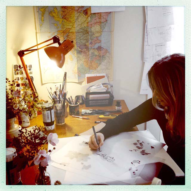
I use them all, but if I had too choose one, my weapon of choice would be a propelling pencil. I love ’em! 

aboutpaage

Your art features many repetitive motifs (hot air balloons, Victorian figures, the ocean, etc.). Do you feel like you work with themes or that you are drawn to a particular image?
I don’t think that I have any particular themes other than that most of the work I enjoy making has some form of pattern, however small a detail it is, it’ll be in there! The balloon images became a theme by accident, I lived in Bristol for seven years and I thought one day I might try a balloon print, as they are such a familiar sight in the city. I enjoyed the endless possibilities of patterns and colours within the balloons and so I got quite carried away and produced a whole series of these. 

DSCF8910

Your images feature many built up layers. Can you tell us a bit more about that process? 
One of the pleasures of screen printing for me, is the ability to play around with the opacity of the inks when mixing them. Printing in overlapping layers, in varying opacity can come up with colours and effects that I aren’t planned, but that make printmaking more interesting for me. I like making it up as I go along! It makes what can be a very technical process, much more interesting and spontaneous.  

Can you tell us a bit more about founding Snap Studio, the artists co-operative in Bristol?
It all came about very serendipitously. My friend Frea and I were manning a pop-up shop in an old hairdressers in Bristol for a few days. We were chatting about how amazing it would be to have a studio, gallery and printmaking facilities under one roof. The man who had the keys to the hairdressers, just so happened to be the founding member of the ethical property company, and owner of  a beautiful 16th century building across the street. He offered it to us at a really reasonable rate which allowed us to seek help from the co-operative development agency in Bristol and go on to form a co-op with six other printmaking friends. We are all either just graduated/ or graduating, so it was perfect timing. It was the perfect setting- post-uni to have somewhere to work. 

SAMSUNG CAMERA PICTURES

You recently moved back to your hometown in rural Scotland. Has this move changed or influenced your work? 
I’ve realised with hindsight that it did at the time. I’ve always been inspired by my surroundings so suddenly, instead of urban scenes, I was drawing chickens and squirrels. I found I missed the urban landscape and I realised there was a danger that my work was unintentionally becoming overly countrified, so I moved my studio from the village to nearby Dundee.

How long have you been printing?
I learned to screen print the same year I graduated in 2001 – so on and off, around fifteen years of squeegeeing ! 

IMG_1435

What is your favourite takeaway?
All of them?!. I live in the middle of nowhere though so takeaway is rare! No-one will deliver this far either 😦

Follow my blog with Bloglovin

Q&A with Tiff Howick

Tiff-Howick-facebook-banner-updated

We are excited to announce our next exhibition will be with Tiff Howick. It will run from Thursday February 4th, with an opening preview on Wednesday February 3rd from 6:30-9pm.

Tiff’s artwork features striking portraits of animals, focusing on dogs and British wildlife. They are done with a loose, expressive style in black ink, printed over a strong colour on crisp white paper.

Tiff-Howick-photo-1

What is your artistic weapon of choice? Pencil, pen, paintbrush, printing squeegee…
It is very hard to choose, I would say overall it’s a paintbrush, I really enjoy experimenting with brushmarks to create different textures.  

Your art features striking portraits of animals. Have you always been drawn to animals?
I have, I grew up with pets – Jack Russells, rabbits and guinea pigs. I also spent my summer holidays in Norway where there were sheep grazing in the forests and we’d see squirrels, deer and elk.  

Your animals are very expressive, like they each have their own personality. Is that something that evolves as each animal is drawn?
Mostly the expression is intentional, I’ll have a reference image with an animal in a pose that I think represents a particular behaviour or emotion such as the spirited French Bulldog or the thoughtful Greyhound.  Sometimes the expressions evolve and either reflect the mood I’m in when I’m drawing or I make subtle changes to the eyes to create an overall feeling that works for the drawing. 

Reading the expressions in my screen prints is subjective, people commenting on my work have seen a variety of different emotions. 

Your art is inspired by your Scandinavian heritage, vintage children’s illustrations, and contemporary fashion illustration. On the surface these styles are quite different, what is it within them that you think draws them all together so successfully?
Over time I have incorporated in to my work the elements of each style that I most admire.  Limited colour palettes from Scandinavian design and the creation of striking images with just one or two colours.  The bold colours are from Scandinavia and my childhood picture books, two of my all-time favourite illustrators are Carl Larsson and Richard Scarry.  The loose, textured brush marks and sketchy lines are inspired by fashion illustration, I am a huge fan of David Downton’s work. 

Tiff-Howick-yellow-hare-screenprint-500x700mm-interior-design
One of your most popular prints has been the Yellow Hare, which features a bright splash of yellow. Some of your prints feature colours that are not traditionally associated with the animal depicted. Do you feel that the colour can change the mood of the animal?
I’ve used bright primary colours to represent extreme versions of the animal’s natural colour, using one vibrant colour to simplify the final image. This sometimes ties in with the mood of the piece, the bright red fox staring assertively over it’s shoulder.  The hare is resting but alert, the bright yellow also representing a hot day in a cornfield.  

Tiff-Howick-red-fox-I-screenprint

How long have you been printing?
I first printed a long time ago on an art foundation course.  I rediscovered screenprinting fairly recently and have been using it to create most of my work for just over three years. Tiff-Howick-screenprinting-work-images

What is your favourite takeaway?
Since starting to work for myself I’ve researched and read a lot about how to make it work.  I would say the best advice, and the hardest for me to stick to, is to focus. Being creative my head is always full of new ideas, there are so many things I want to do and experiment with.  To make a living out of work that I really enjoy I’ve had to pick one idea and work really hard to make my screenprints as good as they can be. 

Or if you mean food it would have to be Indian :o) 

Follow my blog with Bloglovin