See You In Stokey

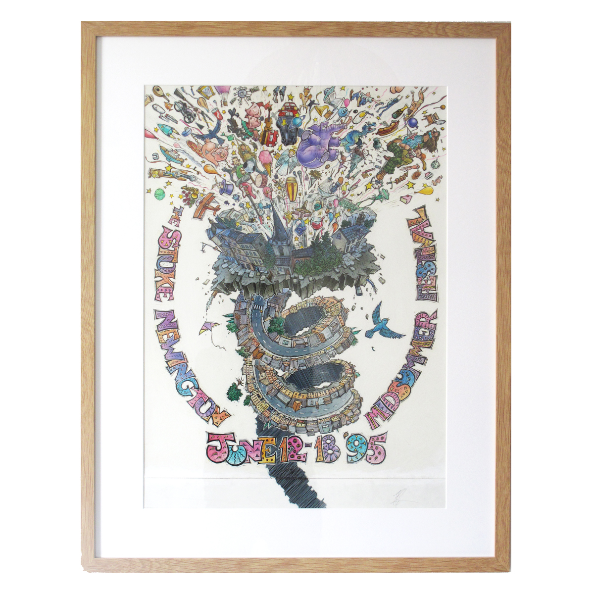
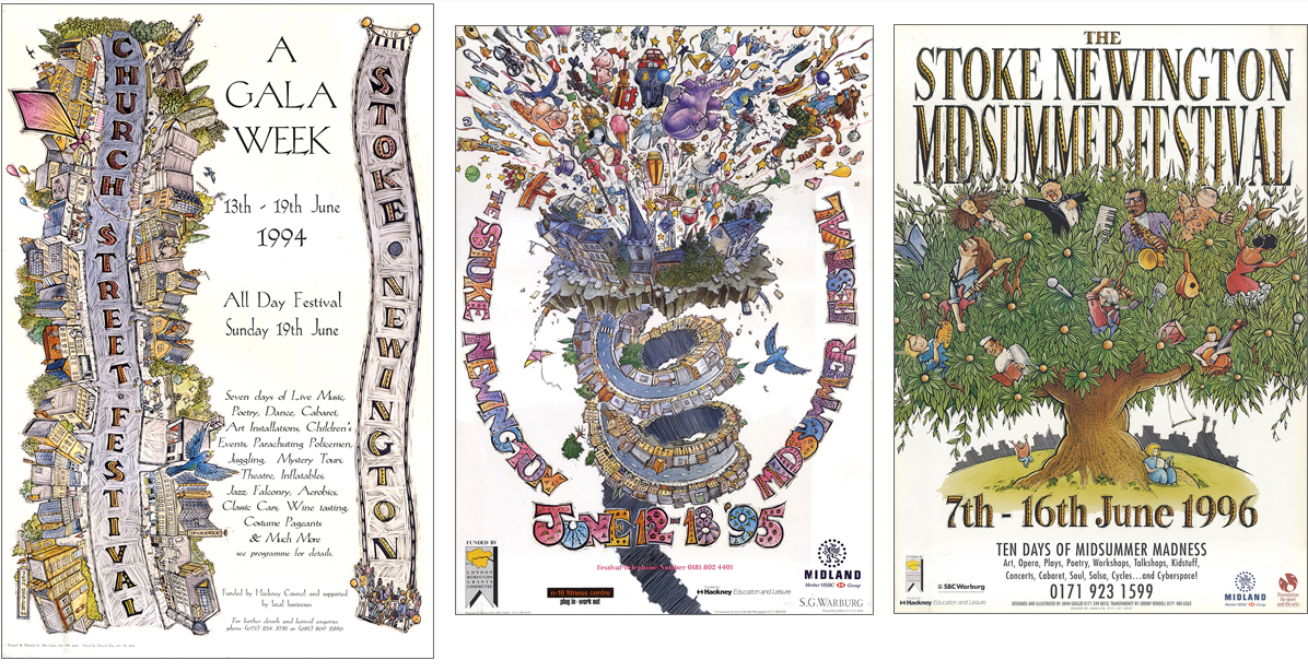
N16 is full amazing shops offering beautiful clothing, jewellery, homeware and cookware, books, cards and more, as well as cafes and restaurants cater to every taste. See You In Stokey celebrates the vibrant and friendly independent businesses that make Stoke Newington unique.

image – seeyouinstokey.com

The See you in Stokey website is a hub and resource for anyone wanting to shop Stokey and support small businesses.

Local businesses care passionately about community and are part of the fabric of what feels like village life here. We’re the friendly faces welcoming you to the area and we’ve created this site to help you discover what’s happening in Stokey, to learn a little of the area’s history and to make it easier for you to shop local.

seeyouinstokey.com
image – seeyouinstokey.com

seeyouinstokey.com acts as a directory, listing the small local businesses categorised by type. So if you are looking for a new outfit, something to eat for lunch or just a coffee you will find it here. All upcoming events are also listed, alongside guides to some of our much loved local landmarks.

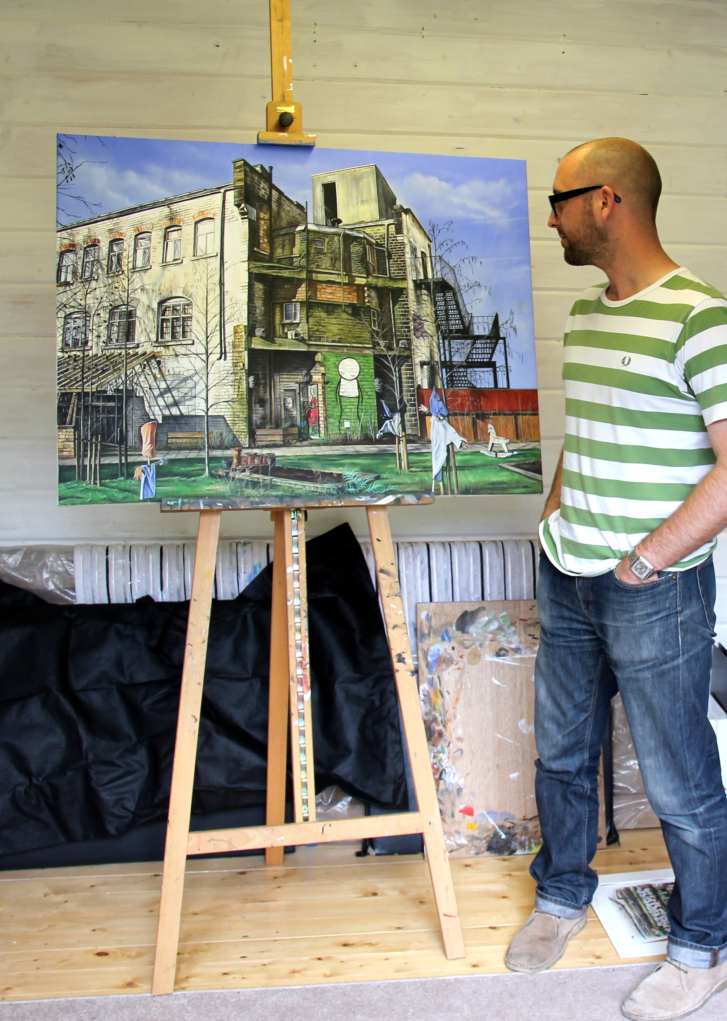
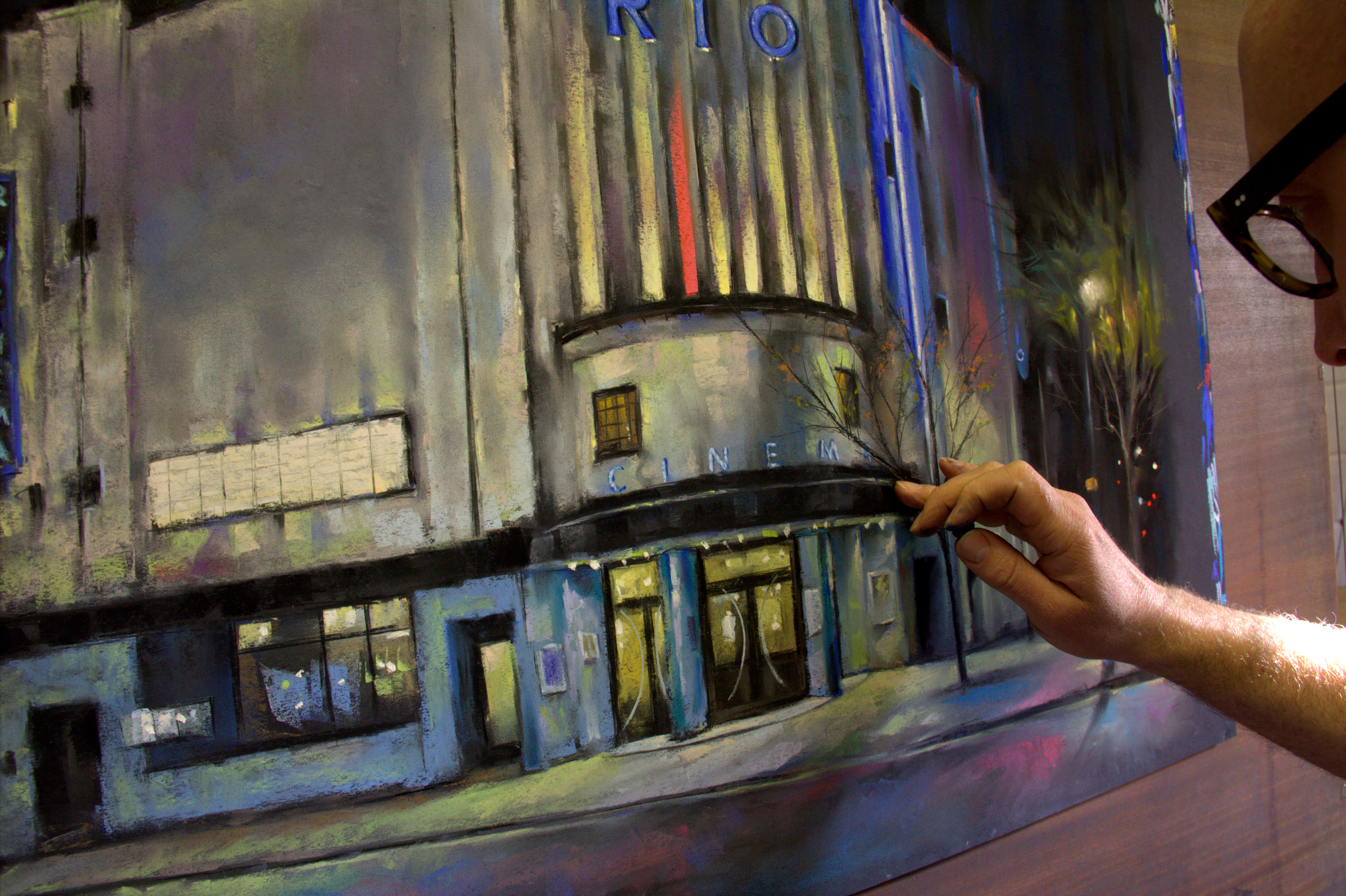
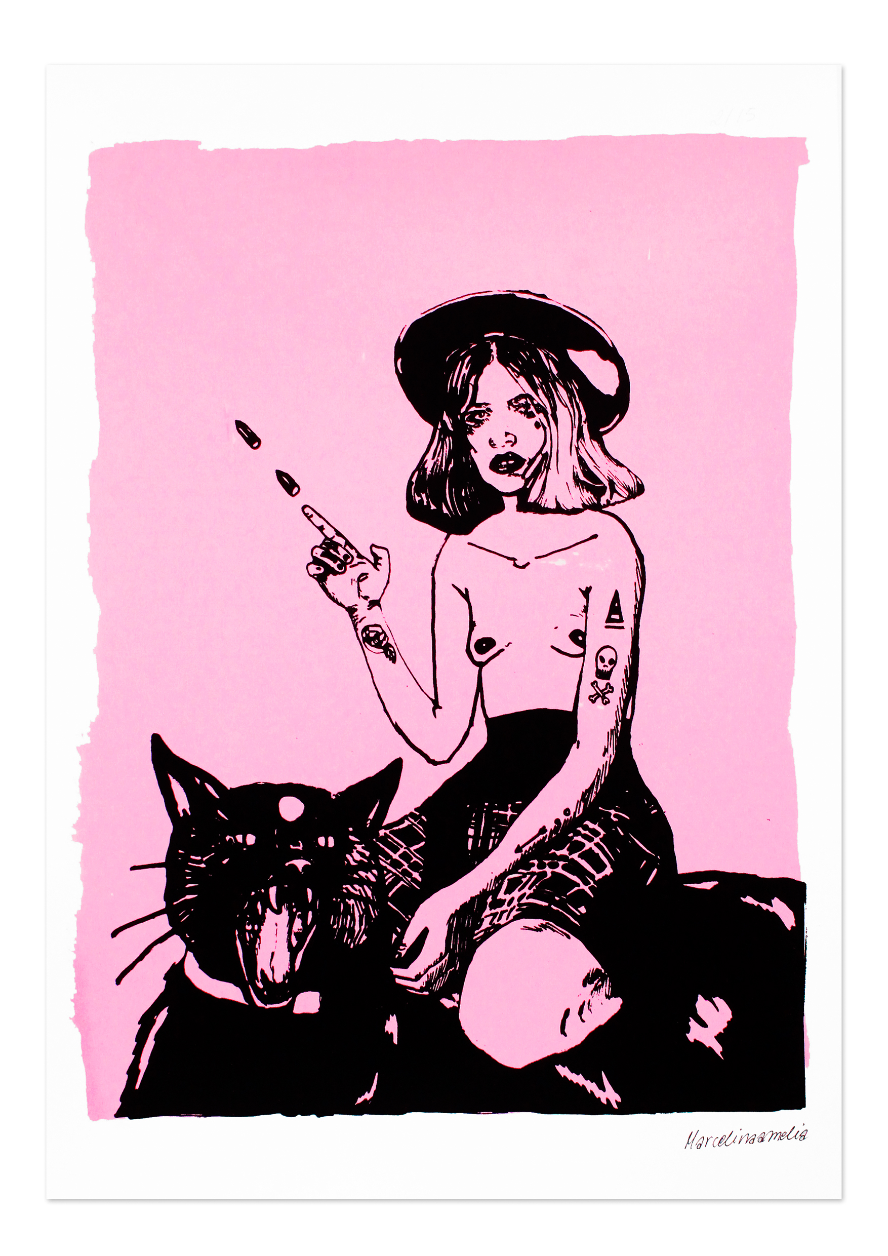
Coming up is the The Invisible People Art Trail. Artist and Guardian cartoonist Henny Beaumont in partnership with Kate Revere of social enterprise Revere the Residence have teamed up with businesses in Stoke Newington to curate the Invisible People Art Trail. Revere the Residence is founded on the idea of employing disabled adults and parents of disabled children in order to level the field. Henny’s daughter Beth works at Revere the Residence in the holidays. Henny explains: ‘Kate and I bonded over a sense that we both feel our daughters are a bit invisible. There is a sense that they are not part of the community, friendships are very difficult and isolation is a real problem.’ The idea for The Invisible People Art Trail was born.

The aim of this trail is to highlight art made by people who feel marginalised or invisible. The work submitted to the trail will be displayed in the shops and business around Stoke Newington. Artwork will be sold with all proceeds going to the artists. Pieces donated by artists will be sold by auction to raise money for the Stoke Newington Business Association for Invisible People 2023. Henny and artist Brigit Connolly have also been working with local special needs school Stormont House to produce plates and mugs with students’ artwork, which will be sold in Stoke Newington this summer. Henny adds: ‘The Art Trail is a celebration of these people’s abilities, an opportunity to make people feel visible and for their artwork to be seen. It’s an appreciation of difference.’

The Invisible People Art Trail will run from 2nd – 10th July. To submit work or find out more, please contact hello@seeyouinstokey.com

Cyanotypes – Becoming Invisible by Liz Loveless

A cyanotype print of a coat. Image: Liz Loveless – Factory Press

Ahead of our upcoming exhibition with Liz Loveless of Factory Press we take a look at cyanotypes. In this show Liz presents us with a selection of artwork involving the cyanotype process. But what is a cyanotype and how are they created?

Dandelion and Grass cyanotypes by Liz Loveless

A cyanotype is a photographic process involving chemicals on paper or fabric that produces cyan blue prints. It was discovered by Sir John Herschel in 1842 as a way of reproducing drawings and diagrams such as architectural blueprints. Cyanotypes are a type of contact print which means the actual image being reproduced is placed directly over the paper. This opens it up to a whole host of creative possibilities, not just reproducing drawings, but using 3D objects. Liz uses this to great effect in her cyanotype works. Everyday objects such as bikes, coats, bottles and vegetation are used to create prints with a unique one-off quality.

A bike being exposed under a UV light onto treated paper. Image: Liz Loveless – Factory Press

To create a cyanotype a mixture of potassium ferricyanide and ferric ammonium are combined to create a photosensitive solution that is then applied to paper. This is allowed to dry in the dark to avoid exposure until it is ready to use. To create a print you must expose this coated paper to UV light, for example sunlight. This then creates a chemical reaction in the parts that are exposed to the light then darkening them. When fully exposed the chemical coated paper is then rinsed under running water. This washes away the unexposed chemical that was in shadow leaving a blank space, surrounded by the blue that was exposed to the light.

A large palm leaf  being exposed in sunlight. Image: Liz Loveless – Factory Press

The most simple way of creating a cyanotype print is to lay objects on to your coated paper and then expose to sunlight. You can experiment with any objects. The more solid an object and the closer it is to the paper the more crisp a result you will get. Further away or less solid an object you will begin to get fuzzier edges. This is most apparent when using natural materials like leaves and flowers. Their 3D quality creates an unpredictable silhouette that fades from crisp dark blue to pale blue blurs. After the cyanotype has had an appropriate time in the sun (this can vary depending on the strength of the sunlight) it is then rinsed under running water and left to dry.

Finished print being rinsed. Image: Liz Loveless – Factory Press

Liz Loveless will be exhibiting more of her cyanotype prints at Of Cabbages and Kings in the show ‘Becoming Invisible‘, which runs from 6 February to 31 March 2020.

You can also book a spot on our Cyanotype Workshop – 2-4pm Saturday 14th March 2020.

Follow my blog with Bloglovin

An Interview with Jo Angell

Jo Angell is preparing for her upcoming show: ‘Awash’ here at Of Cabbages & Kings. Featuring new works from a recent series of prints and paintings; abstract pieces, reflecting the interplay of land meeting water. The inspiration has come from landscapes as diverse as the harbours of Iceland to a riverside Essex village. Her images break the world down into bold graphic shapes, and the melding of texture and colour often reflects the interaction between industrial materials and nature.We’ve asked her a few questions and she talks us through her inspiration and processes.

What is your artistic weapon of choice? Pencil, pen, paintbrush, digital….
All of them in combination! It really depends what I’m working on. With my digital prints I often create shapes, textures and line elements with paintbrush and pens using black ink. I then scan these into my computer and start to work in a digitally creative way, to add colour and layering. With my paintings I use acrylic paint on canvas or plywood. I’m experimenting a lot with paint at the moment, with different brush sizes, substrates and acrylic mediums.


How long have you been printing and painting for?
Following a long career as a graphic designer, I did an MA in Textile Futures at Central St Martins in 2006-2008. It was during this course that I got back into screen printing (actually for wallpaper designs) and become involved with the digital revolution for print on textiles. This progressed into creating all sorts of surface pattern products. One of these was a collection of greetings cards which Tate Modern bought for their shop. I started to think of these as graphic prints as they were popular. This got me hooked into making archival quality digital prints. I also won the opportunity to create some work in a new gallery and further experimented with a set of prints for this. I’ve always painted, but in the past few years I have more felt the desire to experiment with paint and create one off pieces. Acrylic paint has suited me as I love how quickly it dries, and how rapidly I can create layers and textures.

How do you start building up an image?
With some of my paintings I have become interested in a less structured process. This might involve sketching on the canvas and painting a first rough layer. Then I like to allow myself to be more free and respond with the colours and space in any way which takes my mood at that moment. I find this interesting as sometimes this fails, and sometimes something unexpected and fresh emerges.

Where does your inspiration come from?
Travelling and finding new places always inspires me. I take a lot of photos and having just looked at them, there’s a strong theme that I’m always drawn to remnants of bygone eras or worn remnants of industrial bits and pieces. The textures on worn metals, woods and rope. In the past few years, I have been lucky enough to spend time painting in an Essex riverside village called Wivenhoe where boat shapes, rusted chains, buoys and worn wood gives me inspiration aplenty! I’m really inspired by the post war artists who went to St Ives in Cornwall such as Ben Nicholson, Barbara Hepworth, Patrick Heron, Peter Lanyon who sought to create abstract work about the feelings of immersion in a place rather than be representational, using different materials.

Do you find having a background in Graphic Design influences your work?
To me, design and my art are linked. It’s all about balance of form, space and colour. I heard a quote from the artist Ben Nicholson recently which really resonated ‘Abstraction should be a vision of order like good design.’

Your work has a very distinctive set off repeating forms. Do you find yourself drawn to certain shapes and colours to explore a theme?
Definitely! I think most people doodle the same thing when they doodle. Mine tend to feature curves, reflections and rotations of these shapes which could be related to my textile design and pattern making background.

What’s your favourite takeaway?
Is this a foodie question?!
If it is, I love Thai vegetarian curry from Tootoomoo!

To see more of Jo’s work check out Jo Angell’s page on the OC&K site.

Follow my blog with Bloglovin

An Interview with Underway Studio

Ahead of their upcoming show: Printed Spaces: East London Edition at Of Cabbages and Kings (12 April – 5 June 2019 and kicking off with a Private View – 7pm – 9pm, 11 April 2019) we have asked them a few questions.

Underway Studio is a collective of four artists based in Brixton, London. They work collaboratively on screen printed works, with a strong graphic feel that often has an architectural theme. With ‘Printed Spaces: East London Edition’ they explore the architecture of London’s cultural spaces, featuring new prints with an East London focus.

Underway’s, Melissa North, Caitlin Parks, Anna Schmidt and Aiden Barefoot.

There are currently four members of Underway Studio, how did you meet?
We all studied on the same Illustration and Visual Communication degree, but across several years. After graduation, we set up our own studio space to continue working in screen print and it has evolved from there. Initially the studio was a space to pursue our individual practices, but we started to collaborate on a few prints and soon developed a strong collective voice. After having a few different homes across London, we are now based in Brixton where we produce our own work and teach workshops.


How do you work on an idea collectively?
For the past 6 months our work has predominately been focused on the architecture of London’s cultural spaces. We wanted to start this portfolio as both a celebration of the rich culture we have in this city and to showcase the architecture of these spaces, much of which has been re-purposed and developed over the years. When we start developing prints we take a lot of photos and collage these together to see which subjects have the most interesting aesthetic, passing designs between one another until they are ready to be taken into screen print.
What is your artistic weapon of choice? Pencil, pen, paintbrush, digital, print?
Screen printing and collage. We love the way that you can play with scale and overlaying different colours and textures to create a completely unique result.


Tell us about the production side of things and how you produce work as a collective.
We physically share the files and material of what we are working on together. Print designs are passed between the collective until they are finalised and ready to screen printed. As a result, the artworks have an impression from each member creating a unique aesthetic. 

National Theatre by Underway Studio

Where do your influences come from for your subject matter?
Much of our work is influenced by architecture, form, texture and colour. Using a physical print process means that our visual language is both playful and distinctive, embracing any happy accidents along the way.
You have a very distinctive, bold use of colour. Is the colour influenced by the subject matter or come from somewhere else?
Colour lends itself extremely well to screen print.  Overlaying layers and textures creates interesting results that inspire and drive our work. We experiment in the studio doing test prints and playing with different colour combinations and this often leads us to our final palette.


What are your favourite takeaways?
We are all massive foodies and will eat anything from pizza to ramen. Honest Burger in Brixton is a particular favourite of ours, but you can’t beat South London staple Morleys to get us through the long printing hours!


To see more work by Underway Studio take a look at our website here. If you do get a chance come by the shop and check out the show.

Follow my blog with Bloglovin

An Interview with Sarah Beaton

Ahead of her upcoming show IN + OUT at Of Cabbages and Kings, Sarah Beaton talks through the processes that go into creating her bold expressive brush strokes.

1-2
Sarah Beaton’s Studio in Shoreditch

What is your artistic weapon of choice? Pencil, pen, paintbrush, digital….

I love the bleeding of water and paint – watercolour is probably my favourite.

How long have you been painting for? When did you start out?

I have enjoyed painting and drawing from a very young age. My dad was an art teacher so art was always a celebrated skill to explore in my family.

1
Brush stroke experiments with watercolour

Your pictures evoke landscapes. Do you start with that in mind or do you let the brushstrokes inspire you?

I am inspired by nature and find it to be my escape from the busy London life. I don’t usually have a particular image in mind. I enjoy being spontaneous and seeing what develops from the brushstrokes.

1.To_the_Edge_and_Back_-_sarah_beaton_-_of_cabbages_and_kings__25108.1533653706.1200.1200
To The Edge And Back by Sarah Beaton

Where did the idea for including the figures come from?

I was working in my studio listening to the Damian Rice album, My Favourite Faded Fantasy. On the album cover, there is a series of figures on a large wall with a ladder. I loved the illustrative nature of it and decided to try and make my own little images.

35179290_607521426286033_965236828250570752_n
A selection of brushes used to create various marks in Sarah’s work

You use a deep dark blue in your work, what drew you to that colour?

I love water and blue, for me, is the most calming of colours. It can be intense but also very tranquil. I enjoy the extremes of it.

2

You are also a theatre designer, do the two influence each other?

I feel they cross fertilise. Designing for theatre is all about telling stories through a visual narrative. I work in scale all the time and I feel this feeds into my watercolours: finding stories and compositions within an abstract image.

30855164_186884341939105_2429028207475818496_n
Each print is professionally scanned and printed onto Hahnemuhle German Etching 310 gsm

What is your favourite takeaway?

I love Thai food. So anything vegan and Thai is a winner.

You can see more of  Sarah’s work on our website or in the shop. Feel free to pop by on Tuesday 14th August from 7-9pm to meet her in person, view the work up on the walls and enjoy a glass.

1.On_the_Crest_of_a_Wave_-_sarah_beaton_-_of_cabbages_and_kings__54159.1533654434.1200.1200
On The Crest of A Wave – Sarah Beaton

Follow my blog with Bloglovin

Here Comes A City

An Interview with Marc Gooderham

As the face of London changes seemingly overnight, local artist Marc Gooderham has made it his mission to capture these views of the city, the architecture of crumbling and faded grandeur, that are beginning to vanish before our eyes. In the run up to his exhibition Here Comes A City, opening February 8th 2018, we took the opportunity to ask Marc about his paintings and his project.

What is your artistic weapon of choice? Pencil, pen, paintbrush, digital….

There are two. Naturally the paintbrush, but also the highly underrated yet extremely versatile piece of chalk!

studio

How long have you been painting and drawing? When did you start out?

As far back as I can remember. As a child I would sit and draw for hours. Still lifes, portraits, intricate buildings using pen and ink. The first piece of art I sold was to my art teacher at school. He kindly parted with £150 for a still life piece. As a kid, this was all very exciting. I tried not to let that first sale go to my head…honestly.

All your pieces come from real locations, mostly in London. What is it about the urban landscape that appeals to you?

I’ve always lived in London, so it’s a place I know and love. A place of intrigue and new experiences. It’s the contrast of old and new and glimmers of a forgotten time that really appeal to me.

Buildings with a fallen, crumbling exterior always hold an evocative beauty. Cities are a physical thing, they’re made up of lines and interesting forms, and the complexities of architecture and perspective can be challenging at times. But it’s all these things that make it the perfect subject to paint. Buildings command our attention. They’re our homes, places of work, places we admire and fall in love with. They help us navigate our way through life.

What is your process for working on a new piece? 

The only real way of getting to know a city is by walking it. Familiarising myself with the street level views. Making preparatory sketches and photographs. Revisiting a potential location at different times of day – sketch as much as possible! It has to have all the right components, which help make the final composition. Light and shade, suggestions of human life, a glow or reflection in a window, lights shimmering in the distance. These all give harmony and unity to a picture. Once these are in place, I begin work in the studio.

You are now working more with chalk pastels instead of painting, was there anything in particular that drew you to a new medium?

Working with charcoal and chalk pastels has been quite a liberating experience. I am still painting, producing large canvas pieces each month, again of the urban landscape.  I will always paint, however the pastel/charcoal lends itself to working quickly and more instinctively, 50% of the picture is created using my fingers.  There isn’t a lot of room for mistakes which adds to the excitement of this medium, speed is of the essence! It’s about capturing a certain feel or atmosphere and ultimately exercising the art of freehand drawing. It gives the artist a sketch – like fluidity.

Do find yourself returning to locations?

All of time. The locations are very familiar to me. Old haunts or places I have lived naturally become the subject of my work. The city is changing at such a rapid pace, there will always be a new discovery.

What is your favourite takeaway?

 Quite simply ‘Babur To Go.

Studio 2

Follow my blog with Bloglovin

MESH Studio with Marcelina Amelia

fcbk_banner.jpg

On July 6th 2017 we will be hosting the official launch of MESH Studio with Marcelina Amelia here at Of Cabbages and Kings in Stoke Newington. On the opening night there will be a special pop-up shop from 5:30-9pm and the exhibition will run from July 7th until the end of August. We spoke with Marcelina to find out a bit more about MESH and the idea behind the brand.

assplate_mesh_studio_marcelinaamelia.jpg

MESH is a multidisciplinary art brand and design studio founded by artist Marcelina Amelia: Meshing shit up!

Marcelina has taken her artwork beyond the confines of the canvass and has applied it to affordable art objects and wearable art as well as limited edition prints, books and other artworks in a range of different media. Rather than focusing on product design, Marcelina often combines her image making with found household objects to create a series of one-offs within a theme.MESH_STUDIO_GICLEEPRINTS_POSTER_MARCELINAAMELIA.jpgThe Mission Statement:

“Our aim is to embody the term ‘Renaissance girl’, and as the name suggests, we love mixing different techniques and forms, like screen-printing, fashion, painting, ceramics, publications, illustration, politics and activism, because art shouldn’t have any boundaries. We hope that this fluid and meshy structure of the brand, will allow us to collaborate more and make a lot of exciting work and happenings.

MESH’s first collection is titled The Unsatisfied Girls Club and is inspired by the recent movement of strong and powerful women who aren’t afraid to walk tall and proud, manifesting their thoughts, fighting for their rights at the Women’s Marches and other activist happenings all around the world. 

3b.jpg

The Unsatisfied Girls Club is a movement of women wanting and deserving more. Women uplifting each other, and rolling their eyes at the old outdated, stereotypical ways, not being ashamed of their ‘girliness’, standing for themselves and each other, because being a women isn’t a weakness. Research shows that many women are conforming to outdated stereotypes and acting ‘like an alpha male’ to succeed at work – including dressing like a man and hiding ‘girlie’ emotions.”

You can also read our interview with Marcelina on the blog from a few years ago when she had her last exhibition us.

image1

6.jpg


Follow my blog with Bloglovin

Abney Park Trust Fundraiser

Do you remember the legendary Stoke Newington Midsummer Street Fair? How would you like to be the proud owner of the original artwork for the 1995 and 1996 Festival Posters?

Of Cabbages and Kings are very excited to announce an exhibition and charity auction of original framed art by John Gosler to benefit the Abney Park Trust here in Stoke Newington. We have two framed artworks up for grabs, which will be on display at the gallery alongside the original illustration for the map of Abney Park Cemetery, which you may recognise as it is still in use today. 

If you should miss out on the auction do not fret as there are a limited quantity of signed reproductions of the Abney Park map and signed 1994, 1995 and 1996 festival posters available for sale.

In keeping with the original spirit of the festival, our exhibition will run from Monday 12th June, culminating with an event and the end of the auction at 4pm in the shop on Sunday 18th June.

Final bids must be placed by 4pm on the Sunday and we’ll be announcing the winners the same day. To get everyone feeling nostalgic, we’ve got some old programmes to look through alongside other festival memorabilia, we’ll be playing some familiar tunes and serving up some homemade lemonade. See you there from 3pm!

Place your bids here!

FRAMED-1996-LOW-RES
1996 Poster Artwork

FRAMED-1995-LOW-RES
1995 Poster Artwork

John Gosler is a freelance illustrator and former Stokey local. In 1994 John was asked to contribute a poster for the new Stoke Newington Street Festival. He says: ‘It was so brilliant (the festival, that is) that I joined the committee and did the design and artwork the first three posters in 1994, 5 and 6′.

The Stoke Newington Festival began in June 1993 as a small one day celebration on Church Street. It was such a success that by the following year it had grown into a week long event culminating on the final Sunday when the street was closed. With it’s focus on art, music and the local community, it ran for several years from 1994 to the early 2000s. Several stages were erected along the street hosting local bands and the numerous cafes and restaurants had stalls on the road running right up to Clissold Park.

John’s original images for the posters were worked in scraper board, a card surface coated with china clay and then a layer of black ink. Tools are used to scrape off the ink, revealing the white surface beneath, producing an image that looks similar to a woodcut or engraving. He then applied the colour over that with an airbrush.

Abney Park Cemetery is one of the original ‘Magnificent Seven’ cemeteries opened in the mid 1800s to service London’s booming population. It was founded on the principles of renowned non-conformist Isaac Watts and became the burial place of choice for religious dissenters and radical thinkers of the time. It has a non-denominational chapel at its heart that was open to all, regardless of religious beliefs. Another unusual feature of the cemetery is that it was set up as an arboretum, with a wide variety of trees and plants as part of its original design. This meant that when it was abandoned in the 1970s it became completely overgrown and developed a uniquely wild atmosphere. Today the cemetery is maintained as an urban wilderness and is home to a variety of wildlife, as well as operating as a public park. It has also been the setting for open air theatre events and was among the venues taking part in this year’s Stoke Newington Literary Festival, an event that has it’s roots in the original Midsummer Fair.

1.ABNEY-PARK-01-John-Gosler-ofcabbagesandkings

All Postersf you have any old photos or other bits and pieces at home please do let us know as we are hoping to put together a festival archive. Contact Maureen Diffley at maureen.diffley1@gmail.com

Follow my blog with Bloglovin

Adam Bartlett – Painting and Process

Adam_BARLETT_SQ

We are excited to announce our next exhibition with Adam Bartlett aka Tigers of the Universe. You may have seen his prints in the shop over the few months, and we’ll be looking forward to see what comes next! Adam will be exhibiting some original paintings alongside limited edition giclée prints. The show opens with a private view on Thursday April 13th from 6:30pm, we hope you can join us.

Adam creates his paintings by building up many layers of painted patterns to create beautiful decorative artworks.  We were able to grab Adam for a few questions to ask about his work and process.

What is your artistic weapon of choice? Pencil, pen, paintbrush, digital….
My weapon of choice is the trusty pencil, followed closely by the brush.

How long have you been painting for? When did you start out?.
It feels like I have always been drawing and painting, although previously I was a digital illustrator for 8 years. It’s only been the in last 3 years that I’ve started painting again.

You often use a combination of media in your paintings, such as acrylic, spray paint, emulsion and even enamel. How do these combinations influence your final pieces?
The various mediums are used in layers. Emulsion is the base and finally the enamel for fine details. It’s not a hard and fast process, but more something that i enjoy. Also the paints have their own strengths and combined have good contrast and character. I am often unsure of the paints influence regarding the final piece, but more often than not pleasantly surprised.

IMG_6414

IMG_6249

Many of your pieces have jungle animals and lush landscapes. Are they inspired by travel or imaginary locations?
The animals and forests are pure fantasy. I long for a world covered in jungle and forests where the animals and birds can roam free. The natural world is so stunning and I want to capture this in my paintings.

You have also worked in fashion textiles and design, does this background influence your current work?
More and more I feel the influence of textiles creeping back into the paintings, not only with introducing texture again, but thinking about fabric designs etc. It’s exciting to come full circle and bring these various experiences together again, but with a fresh perspective.

Do find you that you come back to certain motifs, themes and colours over pieces?
Yes, I think its important to keep certain repetitive elements in your paintings. Sometimes I feel guilty about repeating things, as if I’m not pushing myself enough, in which case exploiting repetitiveness will suffice.

What is your favourite takeaway?
Mmm, fish n chips or shish kebab

IMG_6324

IMG_6222

IMG_6285

Follow my blog with Bloglovin

An Interview with Lauren Mortimer

Lauren Mortimer Exhibition_Of Cabbages and Kings_Fb banner

Our next exhibition will be with London based illustrator Lauren Mortimer. The opening night is on Thursday September 1, from 7-9pm, and the show will hang until the end of October.

We love Lauren’s graphite illustrations that combine nature elements in unexpected ways, and so it was very exciting when we got to sit down with Lauren for an interview and find out more about the lady herself and her artistic process.Lauren Mortimer_Profile

What is your artistic weapon of choice? Pencil, pen, paintbrush, printing squeegee…
The pencil is pretty much my best friend!

You originally studied Fashion Promotion at Central St. Martins. Has that influenced your current illustration work?
I think that it must have influenced my current work on some level, though if it has, not purposefully. By not having an illustration background, it allowed me to have more freedom and find my style quickly. My work does lend itself well to the fashion world though… I do a lot of editorial work for instance for fashion magazines.Lauren Mortimer Prints_2Many of your pieces include visual puns and hidden meanings, as well as surrealist combinations. How do those themes come together for your pieces?
I think the wonderful thing about illustration is that you can create anything you like on a piece of paper. There are no limits. Though my work is very realistic, I like to mix themes and merge objects together to create something more visually exciting – something that isn’t a reality. Patterns and texture play a huge part of my work too. I like to change the meaning of the objects, and nature will always be huge starting point for me.
 

Some of the projects you’ve worked on include illustrating books. Can you tell us a bit about the process for a larger project like that?
I’ve got 5 books under my belt so far, and I’m working my way through the final artwork of my 6
th, a colouring book. The wonderful thing about big projects like these is that you have a physical product at the end of it with all of your artwork put together. You see it in a different context to the piece of paper you created it on, and you have that proud moment. When my two cocktail books, Tequila Mockingbird, and Gone With The Gin arrived in the post from the publisher, it was really exciting, and definitely a highlight for me.Lauren Mortimer_Gone With The Gin Cover GWTG_Lauren Mortimer_Blade Rummer

There is a slightly macabre and dark undertone to many of your pieces, is that something you find yourself consciously drawn to? Do you find that graphite lends itself particularly well to those themes?
I think that it’s just my style and my interests that come together that way. By contrasting an object that’s soft and beautiful with something that’s hard, for instance, enhances each of them, and creates something poetic in my eyes. For me it’s more about how the viewer interprets it. Everyone should take what he or she wants from it in their own way.

How long have you been making prints?
I’ve been producing limited edition prints for about 4 years now! Time flies!

What is your favourite takeaway?
That’s easy… Pizzzzaaaaaaa!  

Thanks so much! You can see more of Lauren’s work on our website or in the shop. Feel free to pop by on Thursday the 1st to meet her in person, enjoy the work up on the walls and have a glass of wine.

3.Gun_Bunny_2013_Lauren_Mortimer_ofcabbagesandkings2

Follow my blog with Bloglovin