Spotlight on the Ten Bells – Jack the Ripper’s Pub?

by Dan Barton

Allow your mind to wander back in time… to the bustling streets of Victorian London.

Imagine the feel of the cobbles beneath your feet. Your path ahead is lit by smoke-hazed gaslight.

You come to the Ten Bells pub. It’s perched on the corner of Commercial Street, in the Spitalfields district of the East End:

Whitechapel.

The Ten Bells by Marc Gooderham

The pub stands a full 3-floors high — casting an imposing presence on the street below.  Even for those who don’t know the spooky history of the Whitechapel district, it’s the sort of building that sends an invigorating chill down the spine.

And if you were to decide there was something haunted about the place, you’d find many of the Ten Bells’ regular clientele nodding their heads in agreement… as they knock back vintage ale from silver-plated tankards.

Many of London’s pubs are steeped in legend, of course.

But it’s only the Ten Bells that is famous for being the suspected watering-hole of Britain’s most infamous serial killer.

Compelling questions (and clues to answers)

Part of the enduring fascination with the Ripper legend is that the facts are generally as smog-obscured as the Whitechapel streets: 

Who, for example, was Jack the Ripper? What was his real name?

More questions: 

Did the police interview him, perhaps, and then release him? Or was he never apprehended at all?

The possibility exists that we’ll never know the answers to these compelling questions. 

But what we do know is that at least two of Jack’s victims had links to the Ten Bells pub — with some Ripper experts convinced that all of his known victims were connected to this iconic building of London’s East End.

Anne Chapman, for example, drank at the pub often — and is indeed believed to have popped in for a drink at the Ten Bells shortly before her fateful encounter with the Ripper. 

Mary Jane Kelly, too, working as a prostitute, picked up clients on the street outside the pub… and was herself identified as drinking inside the pub the night before she was murdered. 

Now, was Jack the Ripper drinking in the pub at the same time? It doesn’t seem much of a stretch to conclude the answer is “yes”.

1888 was a long time ago, and we still don’t know all the answers. But what’s clear is that the Ten Bells—linking “Jack” with at least two of his targets—is a place of extreme interest for professional and amateur detectives alike. 

If the mystery of Jack the Ripper is ever to be truly unraveled, the Ten Bells may yet prove to be the key.

The work-of-art that continues the story

For true crime enthusiasts—and for art collectors looking to dive deeper into the bustling alleys of Victorian intrigue—Marc Gooderham’s The Ten Bells is a “must own”. 

Marc, of course, is known for his captivating portrayals of iconic landmarks and classic architecture from the Great British capital. 

But for urban atmosphere fused with gripping historical drama, his depiction of the Ten Bells is perhaps king of them all.

Follow my blog with Bloglovin

CMYK OK!

There are many ways to replicate an image in print, and one of them is to screen print using CMYK colours. So what are CMYK colours and how do artists use them to print their artwork?

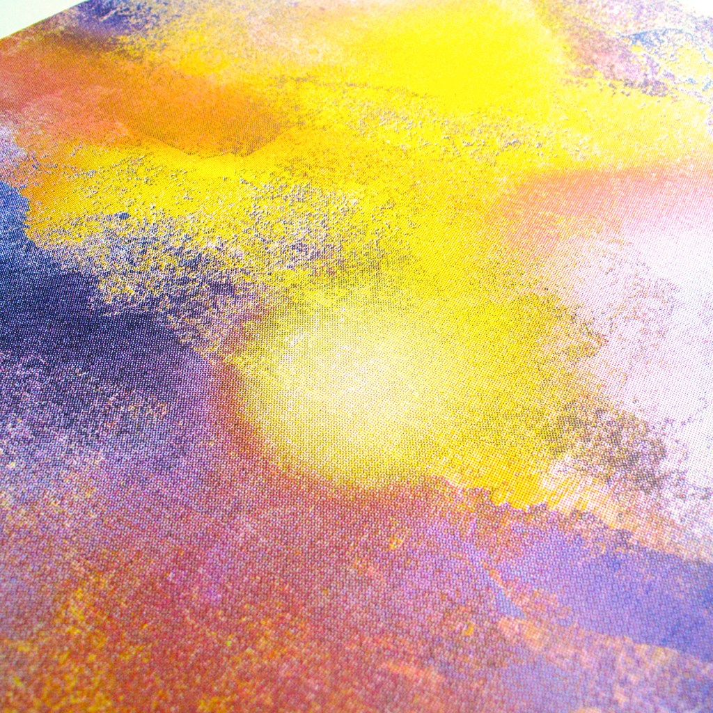
CMYK stands for Cyan, Magenta, Yellow and Key. Key usually being the black layer that is used to align the other colours. These four colours are layered and used in combination with halftoning to create an almost infinite number of colours. It starts with separating the cyan, magenta, yellow and black colours from the image and creating new separate images with each of these individual colour values. A halftone is created from these single colour images which means turning the image into tiny dots.

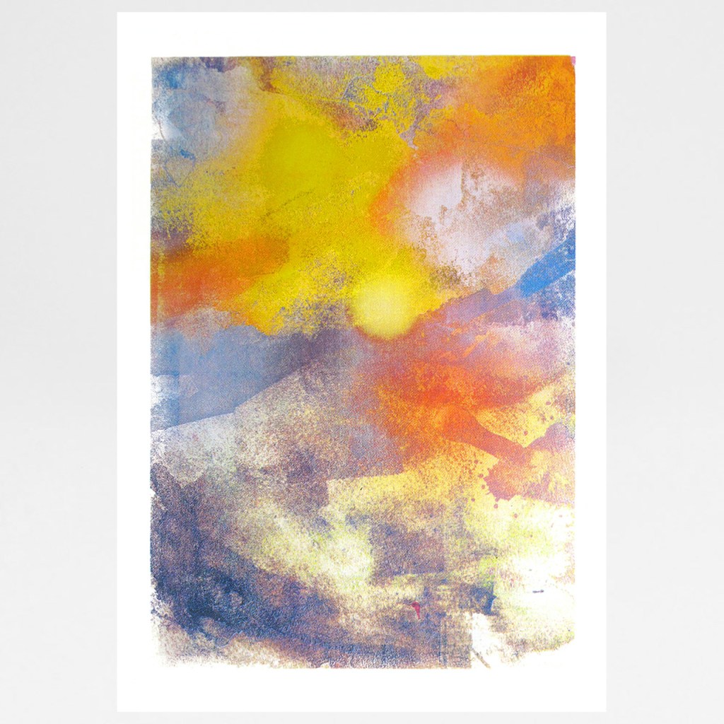
Sunrise by Gavin Dobson

These tiny dots are printed at different sizes depending on how dense that particular colour is in an area of the image. For example an area printed with small cyan dots would appear as pale cyan and larger dots would be a darker cyan. This is because there would be more or less of the white space of the paper showing between the different sized dots. As the dots are so small your eye reads them as one colour when looked at from a distance. To create multiple colours cyan, magenta, yellow and black are combined together at various densities to give the illusion of one colour. On a very basic level an equal sized yellow dot overlaid with a cyan dot would give you green. Changing the size of these dots would give you a pale yellowy green or a darker blue green. With the addition of magenta and black you can create all sorts of colours.

If you look closely at Ponds and Plants by Ashley Amery for example, you can see the small dots that make up the image. It’s easy to see in newspaper imagery where the dots are bigger you get a crude image, and where they are smaller a finer image can be created. Each dot is overlaid at a particular angle so as not to create a uniform pattern that the eye would recognise. If you look closely you can see a rosette pattern of the overlaid dots which is characterful of halftone printing. If the dots are not lined up correctly or are larger, a moiré or interference pattern appears which can cause the image to look blurry.

Below is a selection of artworks that use CMYK separation and halftone printing to recreate the imagery. Some are more obvious but some need a closer look.

Penguin by Gavin Dobson

Screen print on Fabriano paper 310gsm with a deckle edge.

500mm x 700mm

Signed limited edition of 100

Ponds And Plants by Ashley Amery

Screen print on 350gsm GF Smith Colorplan paper

490mm x 550mm

Signed limited edition of 50

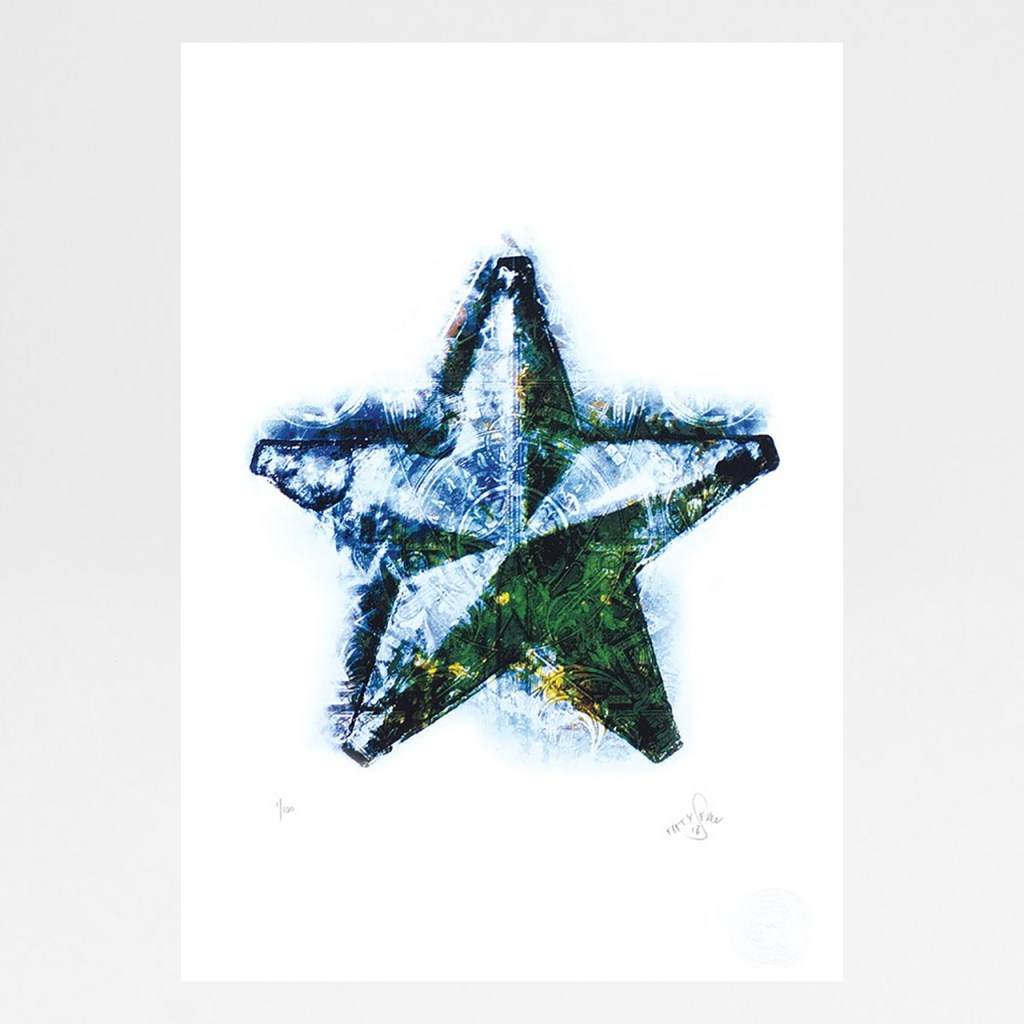
Morning Star by Fiftyseven

Screen print on 330gsm GF Smith paper

297mm x 420mm (A3)

Signed limited edition of 100

Sunrise by Gavin Dobson

Screen print

500mm x 700mm

Signed limited edition of 100

Follow my blog with Bloglovin

Suffolk Lines: An Interview with Rachel Sodey

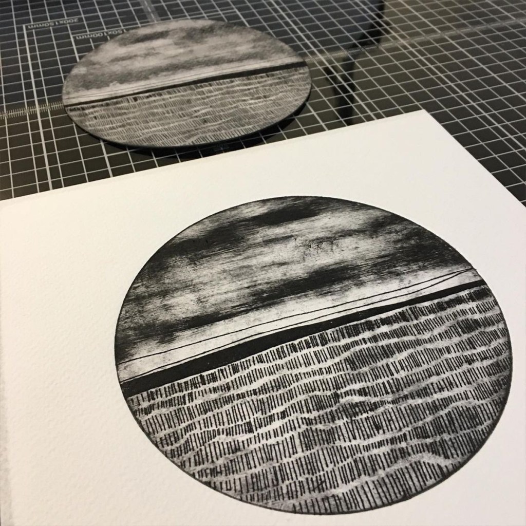
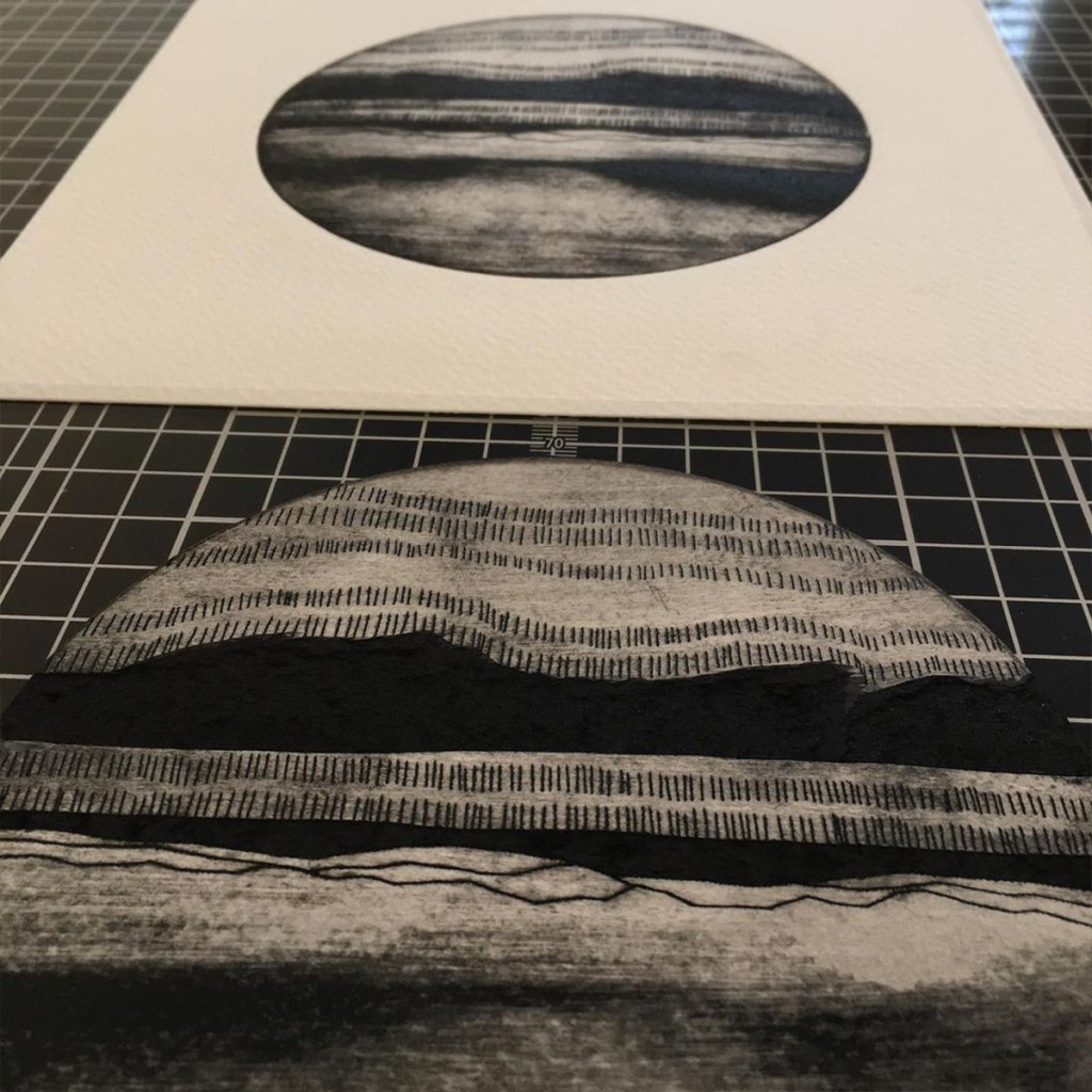
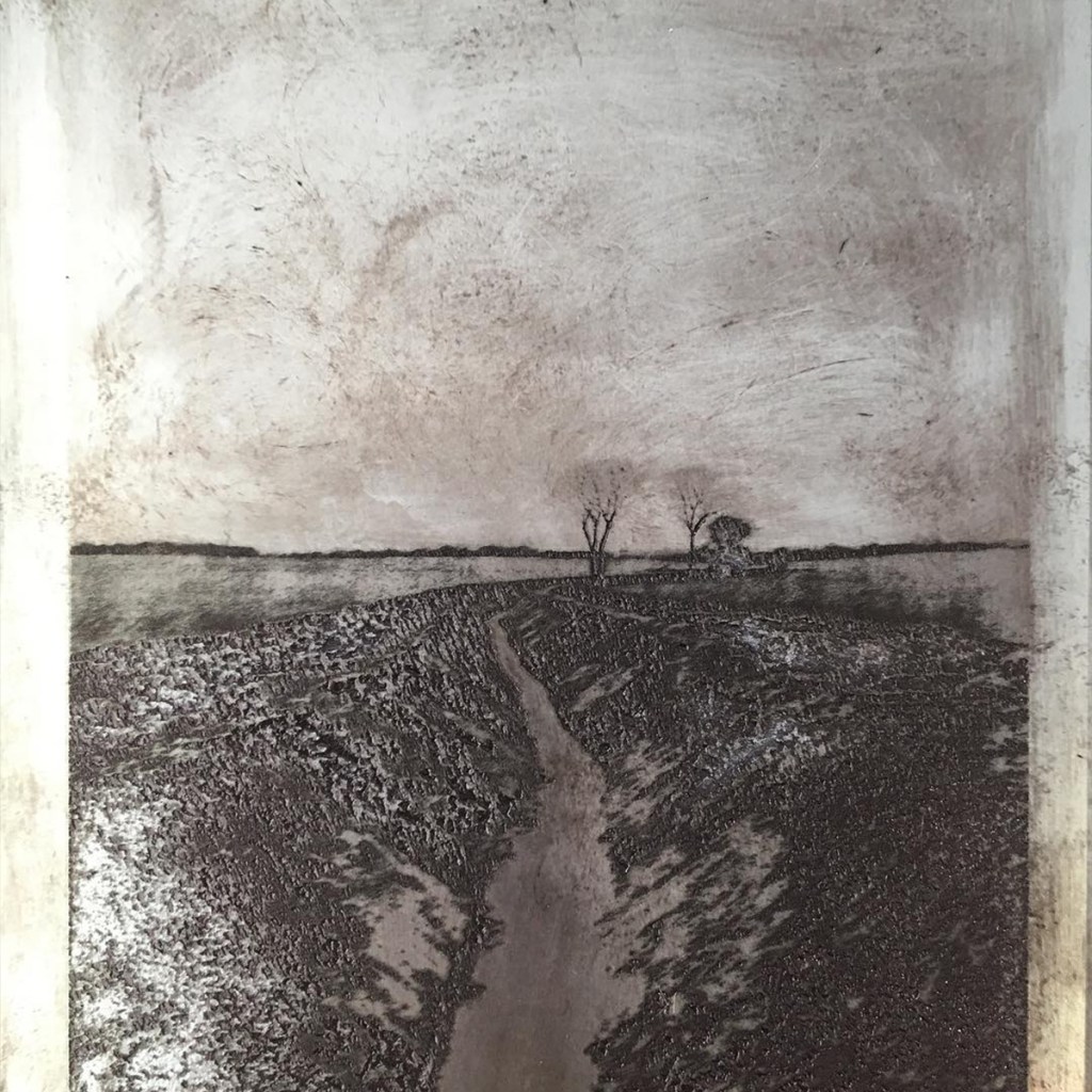
Rachel Sodey is a Suffolk based artist and printmaker who responds directly to the landscape around her. Rachel walks the Suffolk countryside with her dog Bo and draws inspiration from the flat land lines, the changing light, and the mood and feelings of the seasons. We are delighted to introduce a selection of her prints, created using a variety of textural printmaking techniques. In this interview with Rachel we get a little insight into her work and find out more about her process.

How long have you been printing for? When did you start out?

My first real experience of printing was at The Norwich School of Art where I studied a degree in fine art textiles. My favourite workshop was the print room and I definitely spent most of my time in there. The technicians were absolutely amazing and taught me so much. At Norwich I mostly worked with screen printing and free-hand embroidery. It was only when I started teaching at West Suffolk College that I rediscovered my love for printing through teaching it. I have the freedom to teach all aspects of printmaking and this is what drives my own work forward.

What is it about the Suffolk landscape that inspires you?

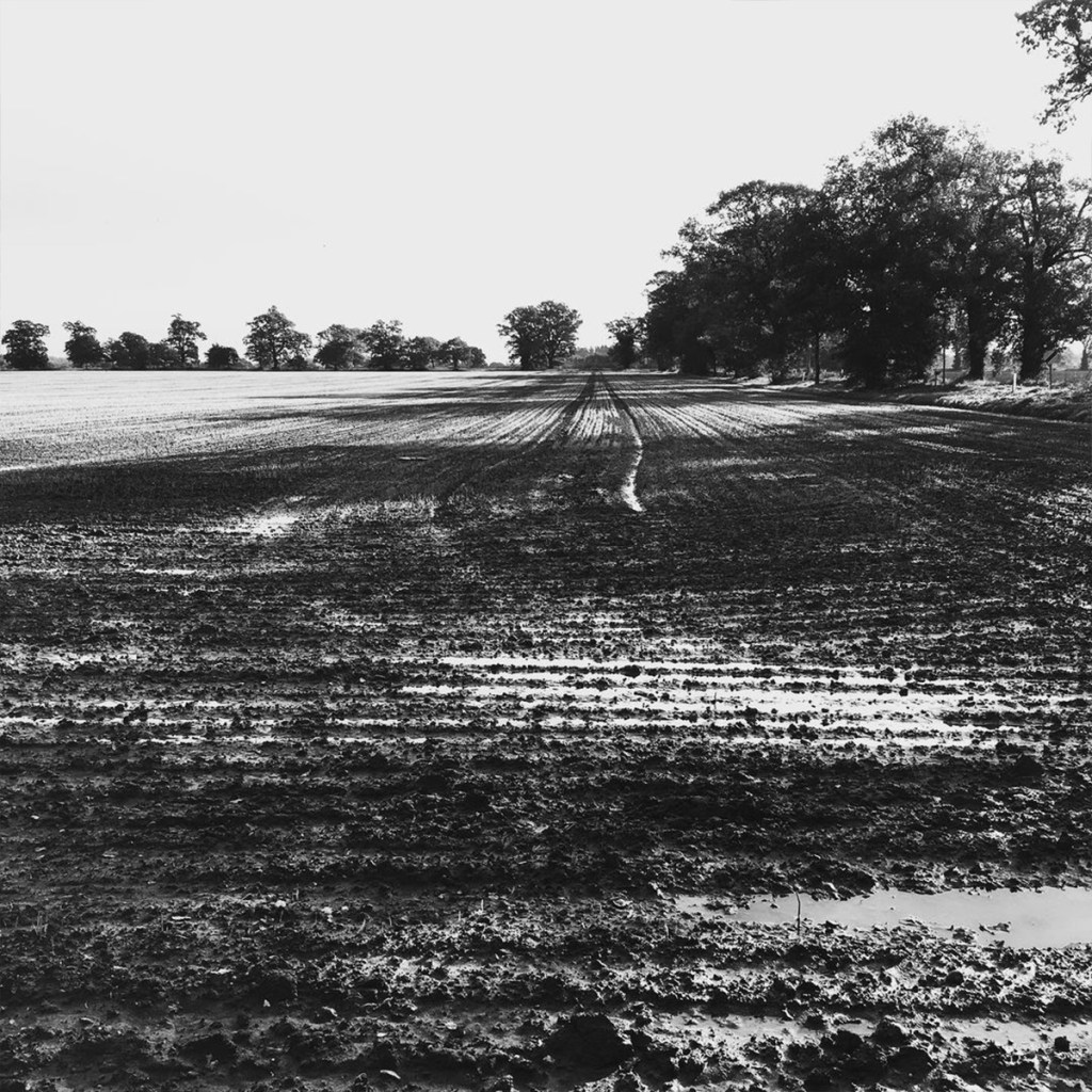
I am definitely obsessed with the flat fields of Suffolk and the clear horizons. Even from a young age I have had favourite fields and just cannot stop photographing the perspective lines.

A lot of your prints take an unusual circular form; how did that come about?

This was by accident really. I had written a project for my students and set the parameter that they all had to produce art work within a circular form. In one particular lesson in the print room, I demonstrated to the students how to create an intaglio plate on a circular piece of drypoint cardboard. When I put it through the press I was really happy with the outcome. This 10-minute demonstration inspired a whole new series of work. Most of my prints evolve from little experiments.

Tell us about the process creating your prints and how you create your plates

I mostly work on drypoint cardboard and make marks onto the plate by using a craft knife. I also have the choice to peel away layers of the cardboard which will hold the colour of the ink (just like the engraved lines) when I print it. The shiny surface of the plate also allows me to create mono prints as well. I am able to choose how much ink to leave on or wipe of the surface, this makes the printing process very exciting as I am never quite sure how each print will turn out.

You talk about the inking process being part of the experimental nature of the printing. How does the process of printing influence the end result?

There is so much to consider when printing a plate. I use the scrim to wipe the ink off the plate once it has been pushed into the engraved lines that I have made. The scrim then also becomes a tool to add movement to my prints – it is a painterly approach really. Although I have a certain amount of control that influences the end result, there are other factors at play such as how damp the paper is and the pressure the press is set to. I am just never quite sure how effective a print will be until I peel the paper away from the inked up plate.

You mention walking, where is your favourite place to walk?

My favourite place to walk is getting lost in the fields in the village where I live in Suffolk. After about 10 minutes of walking I am able to let the dog off the lead and I am just surrounded by fields. Lately on my walks I have been seeing a heron in one certain field which is completely amazing.

Have you found lockdown influencing or changing your work in any way?

Teaching online during lockdown has definitely been challenging so this has left me with less time than normal to get out in my studio. I think lockdown has made me appreciate the ability of being able to escape in my printmaking more.

Whats your favourite takeaway (food)?

Well normally I would definitely say my favourite takeway is a good old vegi curry, but I must say that lockdown has made me crave for a big fat juicy halloumi burger with fries.

Thank you Rachel.

To view more of Rachel Sodey’s work visit her Artist’s Page on ofcabbagesandkings.co.uk.

Follow my blog with Bloglovin

A Ray of Sunshine

It’s been bitterly cold on the London streets outside Of Cabbages and Kings. We have had snow, ice, and freezing winds and were chilled to the bones. So to remedy that we have brought together a collection of gift ideas to chase away the frosty weather. Think of this as a visual mug of hot chocolate. Grab a blanket, get cosy and read on.

Sunbathing by Marcelina Amelia – £250.00

We may be longing for those summer holidays so let Marcelina Amelia take you there with this screen print. She describes this print as a cure for seasonal affective disorder, and came up with the idea lying on a beach being bathed in the sun. The warmth of peachy circle in the middle inviting you to dive right in. This print will definitely see you through the winter months until summer comes back around.  

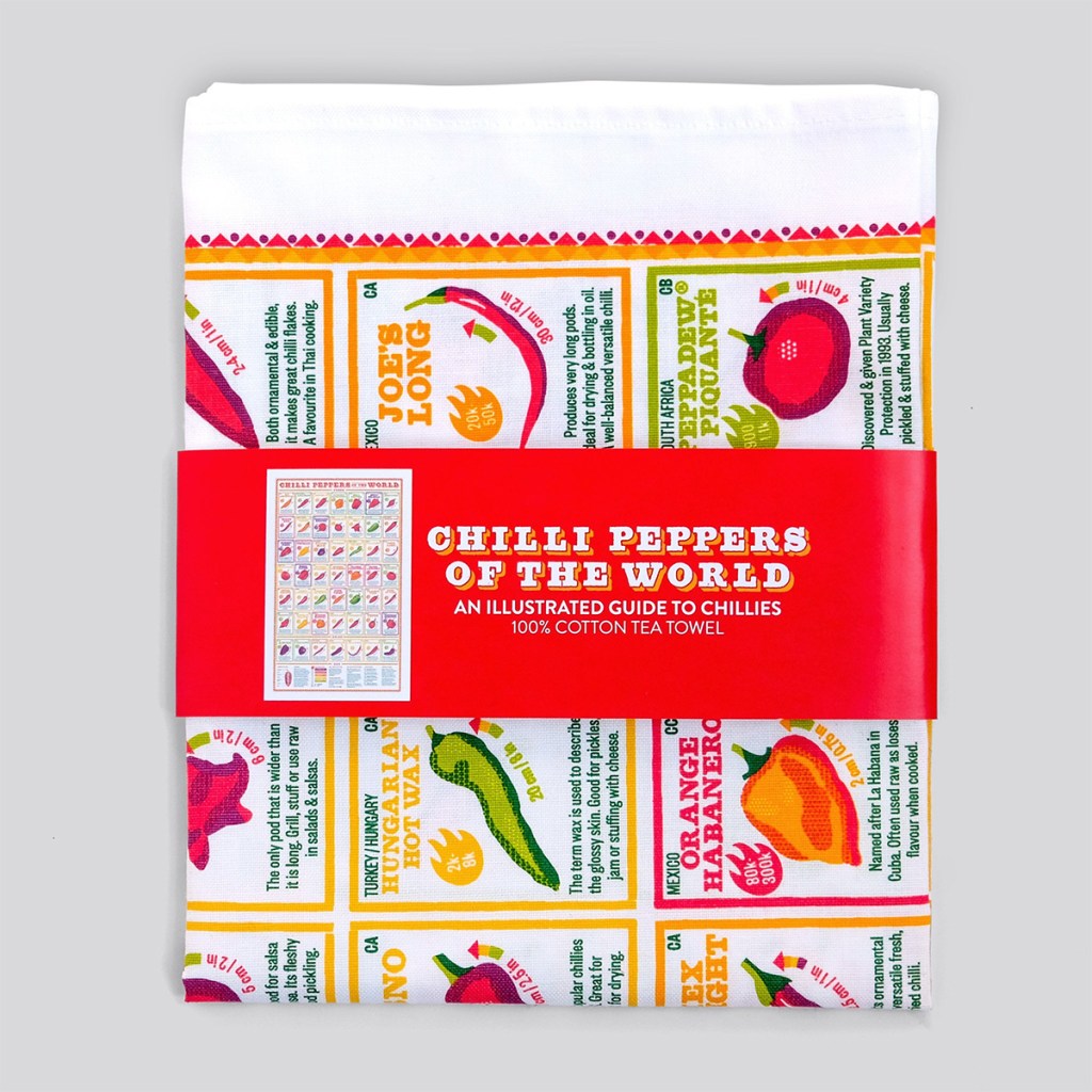
Chilli Peppers Of The World Tea Towel by Stuart Gardiner – £12.00

Why not warm up from the inside with one of nature’s hottest foods? The spicy chilli pepper! Illustrated with an array of facts about popular chillies from around the world the towel includes a taste guide, Scoville heat unit, and ripening colour. Since Columbus brought chilli peppers back to Europe five hundred odd years ago, we’ve been obsessed with these flavourful pods of heat; it’s no surprise that they’re one of the most influential spices in world cuisine.

Fire In The Belly by Tom Berry – £45.00

Is that too many chillis in the belly or the fire of life burning inside this character? With striking painterly detail, Tom Berry has built up a combination of blues, yellows and oranges to represent the fire of one’s life force burning strongly within us warm blooded humans. An inspirational print to encourage ambition.

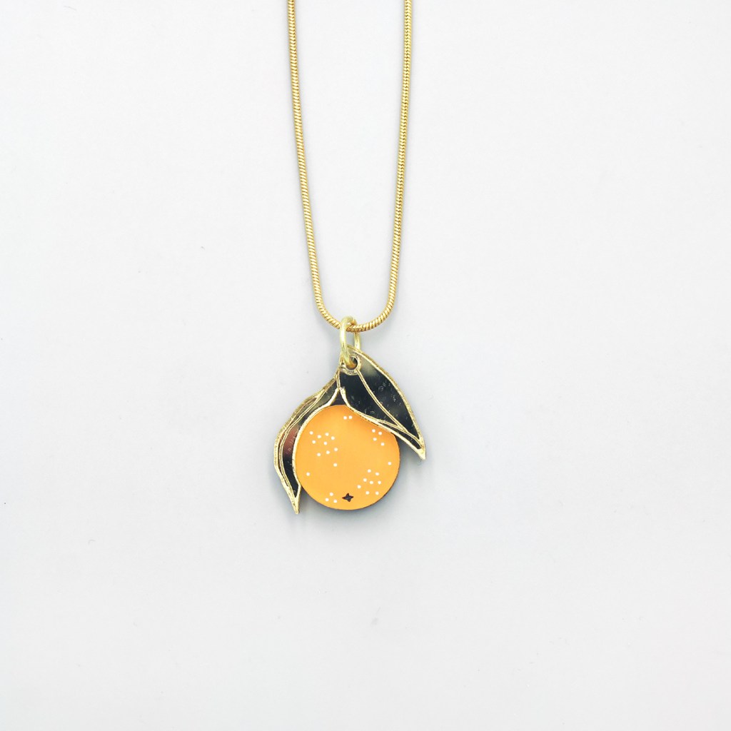
Mini Orange Necklace by Wolf and Moon – £28.00

You can’t get sunnier than an orange! This Mini Orange Necklace sings of the essence of a Mediterranean summer. The bright little fruit is made with recycled orange and gold mirror acrylic leaves, and hang on a silky gold plated snake chain.

Moroccan Haze by Caitlin Parks – £90.00

Sunny Morocco is depicted in this warming screen print by Caitlin Parks. The hazy desert heat and light of a rocky landscape is offset by arched shapes of buildings and the outlines of palms, while overlapping layers of orange and yellow bring the sunshine inside.

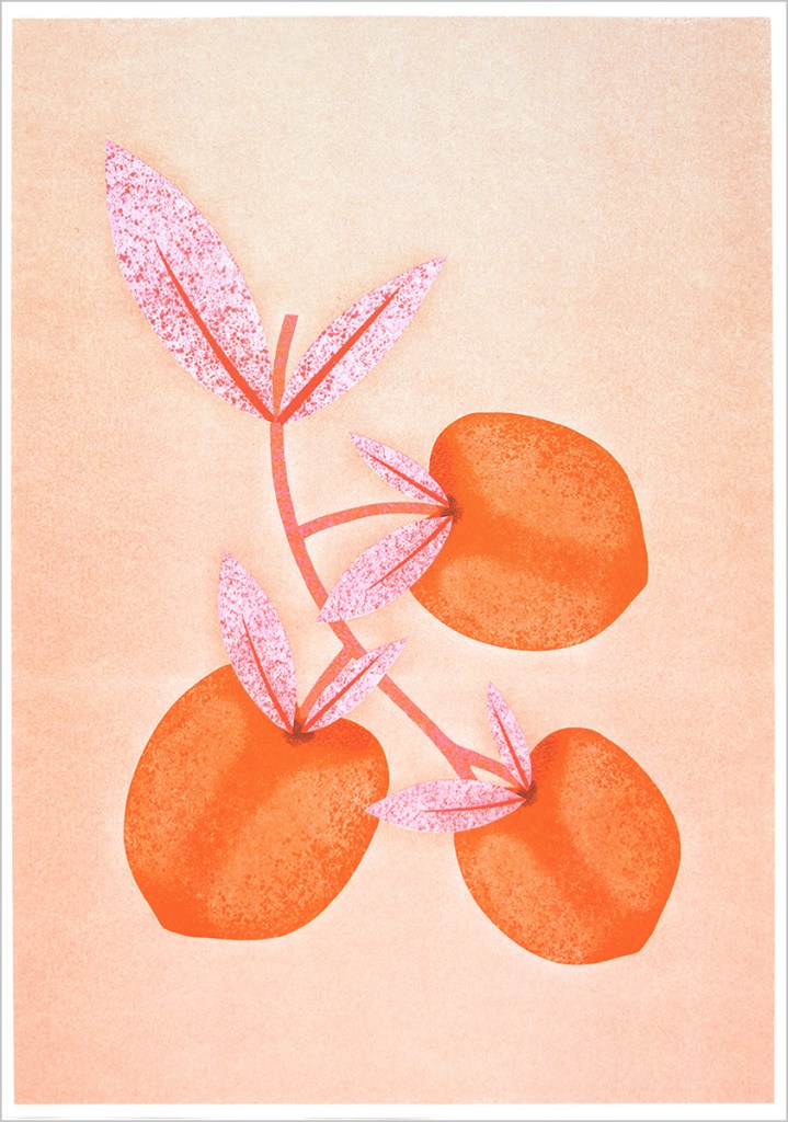
Botanical Peaches by Melissa Donne – £20.00

Nothing beats a juicy peach on a hot day! These summer fruits have been depicted in warming pinks and oranges in this risograph by Melissa Donne. Inspired by traditional botanical illustration, Melissa first sketches and then develops her prints digitally before printing.

Venus Ring  by Roderick Vere – £125.00

Did you know that Venus is the hottest planet in our solar system? Roderick Vere’s Planetary Collection takes its inspiration from the planets. This Venus Ring is crafted by hand and finished with a satin sheen. A 22ct gold plating covers the dome and completes this striking fully hallmarked piece of jewellery.

Sunrise by Gavin Dobson – £140.00

A hot sun rises in this evocative screen print by Gavin Dobson. The magical scene uses the classic printing colours of cyan, yellow, magenta and black to expresses the beauty of sunrise in an abstracted landscape.

Follow my blog with Bloglovin

The Art of Love – Inspiring Prints for Valentine’s Day

They say a picture paints a thousands words, so why not let that picture speak a thousand words of love? With this post we bring together some of the most heart-warming prints at Of Cabbages and Kings.

Love Is Finding Home In Another by Anastasia Beltyukova – £50.00

Two lovers embrace with a kiss – ‘Home’ is with someone you love. This couldn’t be better represented than in Anastasia Beltyukova’s risograph print Love Is Finding Home In Another. The print is from a series titled ‘I Am Home’ and was created for an exhibition exploring the theme of home and identity and the parallels between them.

Artist: Anastasia Beltyukova
Medium: Risograph print
Size: 340mm x 460mm
Edition: Signed limited edition of 25

A Year And A Day by Freya Cumming – £280.00

“O lovely Pussy! O Pussy, my love, What a beautiful Pussy you are, You are, You are! What a beautiful Pussy you are!”

Sail away with your loved one. This hand printed, limited edition silkscreen print by Freya Cumming, A Year And A Day, takes its inspiration from the famous Edward Lear poem, The Owl and the Pussycat. This nonsense poem starring an unlikely coupling and their romantic adventure, it is often recited at weddings. Freya has hand finished this print with gold and silver leaf to add an extra layer of magic.

To read more about artist Freya Cumming see our Q&A on the OC&K Blog.

Artist: Freya Cumming
Medium: Screen print with gold and silver leaf
Size: 460mm x 460mm
Edition: Signed limited edition of 34

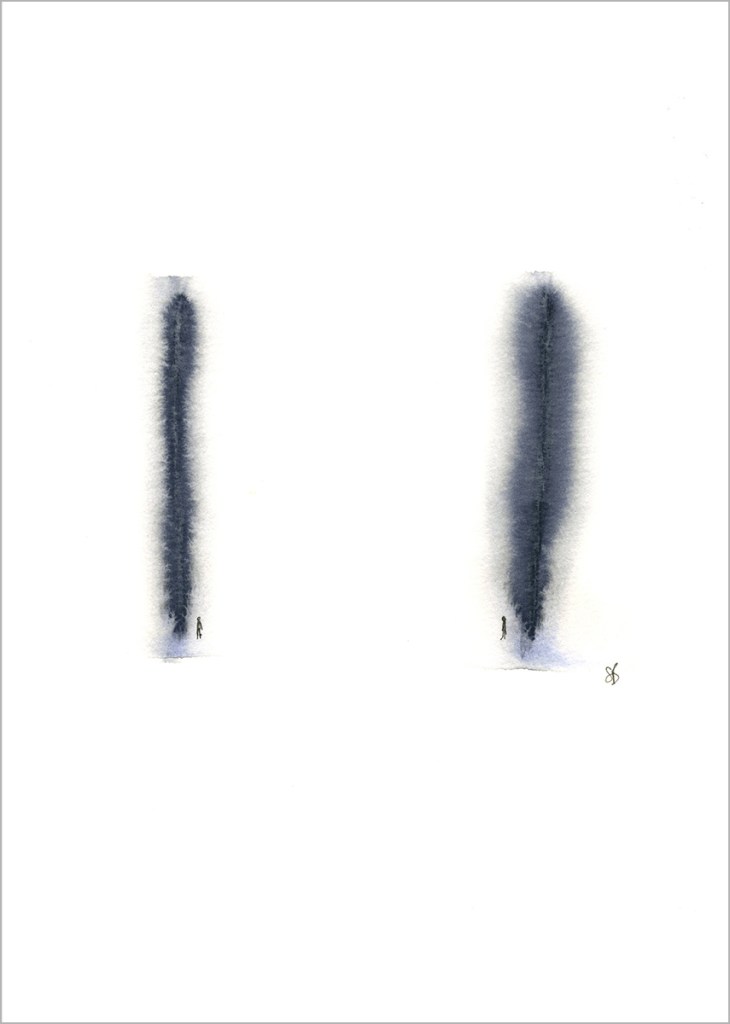
Poles Apart But Very Much In Love by Sarah Beaton – £60.00

Distance is no barrier to love. You may be far away, but your kindred spirit is always close. Poles Apart But Very Much In Love is a limited edition giclée print taken from one of Sarah Beaton’s original watercolours. Inspired by her childhood in Scotland: scaling mountains, exploring forests and living by the sea, Sarah’s abstract brush strokes create a landscape, evoking a sense of place in which she adds a solitary figures to create a narrative. 

Artist: Sarah Beaton
Medium: Giclée print
Size: 406mm x 305mm (12″ x 16″) including mount
Edition: Signed limited edition of 50

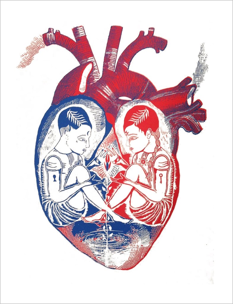
Guardians Of The Heart by Johnathan Reiner – £75.00

Two figures guard the heart and keep the flames of passion burning. Guardians Of The Heart is a bold two colour screen print by Johnathan Reiner. A strong and poetic design in red and blue. As long as the guardians remain the life force burns inside them.

Artist: Johnathan Reiner
Medium: 2 colour hand pulled screen print
Size: 297mm x 420mm (A3)
Edition: Signed limited edition of 100

Singing In The Rain by Factory Press – £85.00

Liz Loveless of Factory Press creates beautifully illustrative and expressive prints in a variety of mediums. Two tap dancing shoes are surrounded by a whole host of collaged elements. Umbrellas, raindrops, lamp posts and even musical notes fly around them, bringing to mind the famous Gene Kelley film Singing In The Rain.

To read about our tour of Factory Press visit the OC&K Blog.

Artist: Liz Loveless / Factory Press
Medium: Screen print and collage
Size: 500mm x 700mm

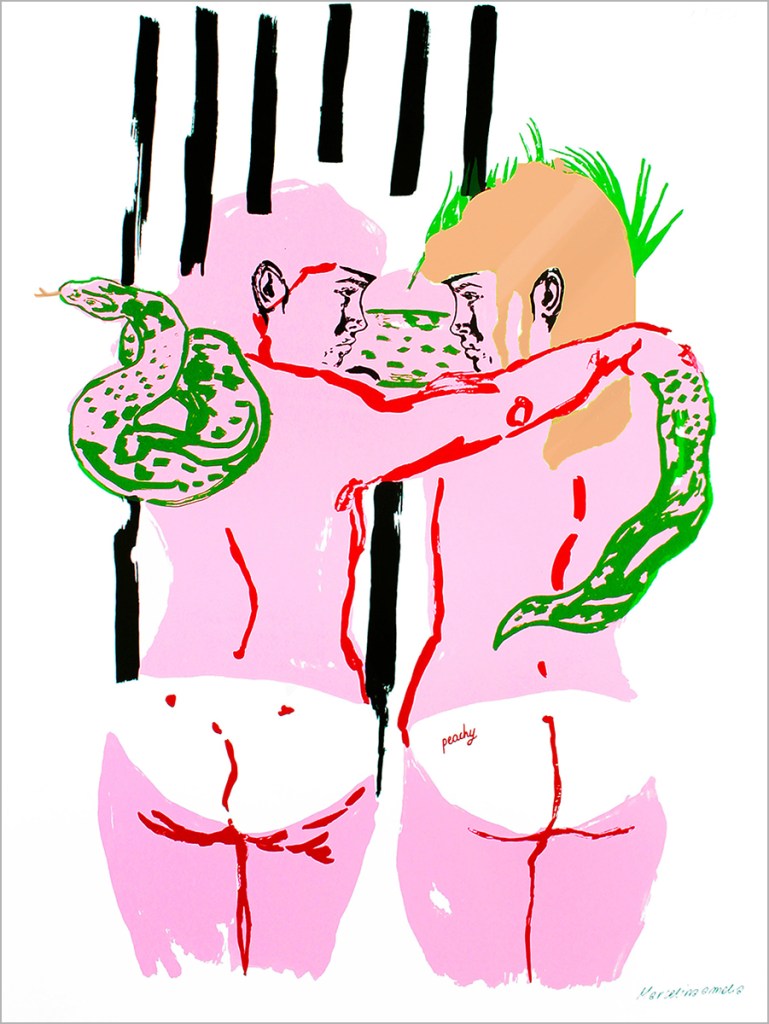
Pink Matter by Marcelina Amelia – £250.00

Two bodies lie as if they are sunbathing with arms around each other and a snake draped over their shoulders. This striking screen print by Marcelina combines her distinctive drawing style with the intensity of bright neon colours. Their backs to us the figures display peachy bums. Knickers or tan lines? Their pink skin hotly glows.

For an insight into Marcelina Amelia’s process see our interview with her on the OC&K Blog.

Artist: Marcelina Amelia
Medium: Screen print with copper foil
Size: 500mm x 700mm
Edition: Signed limited edition of 35

Follow my blog with Bloglovin

OC&K Curates – Spring Time

Fresh green leaves and spring bulbs are starting to appear around us. The days are lengthening and blue skies shine above. Spring is such a lovely time of year and what with Mother’s Day coming up on Sunday 22 March there are plenty of reasons to bring a spring feel into your home, or give a gift with some springtime inspiration.

Spring is the time of year colour returns to our life. Slowly at first with gentle pastel tones, until the riot of hot summer takes over. It’s fresh and has a hint of warmth that banishes the memory of cold frosty mornings. Flowers begin to poke their heads out of the earth and there is an energy in nature. Freya Cumming’s work speaks of spring; her eye for gentle colour complimenting the season. This screen print titled Village Politics with its ‘best in bloom’ is finished with gold and silver leaf and is a great way of adding a bit of bright country style to any room.

Village Politics by Freya Cumming – £250

Polka dots still seem to be a firm fashion favourite and could be seen in the spring collections of some of the most well know fashion designers like Dries Van Noten’s collaboration with Christian Lacroix and Carolina Herrera. Your favourite spotty outfit needs a spotty accessory. These Form Circle Earrings from Tom Pigeon in Blush add a cool edition of colour to your outfit. A combination of Formica and brass they are perfect for any time of day or night.

Form Circle Earrings in Blush by Tom Pigeon – £30

You can’t have spring without fresh leaves appearing on the trees. This clock features a hanging willow branch pattern, evoking the dappled shade of sitting under a tree. Made from laser-cut, powder-coated steel, it features a quiet quartz mechanism and stamped aluminium hands. A minimal yet stylish way to celebrate nature.

Grass Green Willow Clock by Max Cairns – £100

Speaking of leaves, these leaf bookmarks by Another Studio just had to be included. They make the perfect little gift for a plant lover and feature the leaves of Maranta Leuconeuraia, Peperomia Argyreia, Caladium Bicolour and the Begonia Maculata. Celebrate the season of growth.

Leaf Bookmark Set – Steel by Another Studio – £9.50

It’s the time of year we start thinking about our gardens, (or any little space we may have set aside for growing things). If you are conscious of all the plastic used in the garden then this is the perfect way to go. Giving you the ability to produce recyclable and biodegradable newspaper pots for starting seedlings. These pots can be planted straight into the ground minimising damage to the roots of young plants. To read more about how they are made check out our ‘How to make Paper Pots using the Paper Pot Press’ Blog Post.

Paper Pot Press by Creamore Mill – £12.50

Spring colours are alive in this fun combination of Collage Studs from Wolf & Moon. This set of four mix and match earrings combine brass, painted wood, acrylic and mother of pearl. A versatile set in shades of green offset with some sparkle that will add spring vibes to any outfit.

Collage Studs by Wolf & Moon – £38

I had to end with this fun screen print by Tiff Howick of a yellow duck. Tiff Howick captures its fluffy feathery body with an expressive use of marks. Bold and bright in strong yellow colours, this is the perfect print to waddle into your home. A little duckling is an iconic image of spring and makes you think of new life.

Yellow Duck by Tiff Howick – £40

Follow my blog with Bloglovin

Cyanotypes – Becoming Invisible by Liz Loveless

A cyanotype print of a coat. Image: Liz Loveless – Factory Press

Ahead of our upcoming exhibition with Liz Loveless of Factory Press we take a look at cyanotypes. In this show Liz presents us with a selection of artwork involving the cyanotype process. But what is a cyanotype and how are they created?

Dandelion and Grass cyanotypes by Liz Loveless

A cyanotype is a photographic process involving chemicals on paper or fabric that produces cyan blue prints. It was discovered by Sir John Herschel in 1842 as a way of reproducing drawings and diagrams such as architectural blueprints. Cyanotypes are a type of contact print which means the actual image being reproduced is placed directly over the paper. This opens it up to a whole host of creative possibilities, not just reproducing drawings, but using 3D objects. Liz uses this to great effect in her cyanotype works. Everyday objects such as bikes, coats, bottles and vegetation are used to create prints with a unique one-off quality.

A bike being exposed under a UV light onto treated paper. Image: Liz Loveless – Factory Press

To create a cyanotype a mixture of potassium ferricyanide and ferric ammonium are combined to create a photosensitive solution that is then applied to paper. This is allowed to dry in the dark to avoid exposure until it is ready to use. To create a print you must expose this coated paper to UV light, for example sunlight. This then creates a chemical reaction in the parts that are exposed to the light then darkening them. When fully exposed the chemical coated paper is then rinsed under running water. This washes away the unexposed chemical that was in shadow leaving a blank space, surrounded by the blue that was exposed to the light.

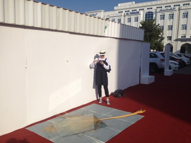
A large palm leaf  being exposed in sunlight. Image: Liz Loveless – Factory Press

The most simple way of creating a cyanotype print is to lay objects on to your coated paper and then expose to sunlight. You can experiment with any objects. The more solid an object and the closer it is to the paper the more crisp a result you will get. Further away or less solid an object you will begin to get fuzzier edges. This is most apparent when using natural materials like leaves and flowers. Their 3D quality creates an unpredictable silhouette that fades from crisp dark blue to pale blue blurs. After the cyanotype has had an appropriate time in the sun (this can vary depending on the strength of the sunlight) it is then rinsed under running water and left to dry.

Finished print being rinsed. Image: Liz Loveless – Factory Press

Liz Loveless will be exhibiting more of her cyanotype prints at Of Cabbages and Kings in the show ‘Becoming Invisible‘, which runs from 6 February to 31 March 2020.

You can also book a spot on our Cyanotype Workshop – 2-4pm Saturday 14th March 2020.

Follow my blog with Bloglovin

Inspired by Architecture

We have seen recently a lot of design trends taking inspiration from architecture. Two styles that have proven popular are art deco and brutalism. Both rely on strong bold lines and confident use of graphic shapes, along with a creative approach to materials. The shapes and details that go into characterising these artistic movements are drawn upon by designers and makers, infusing their pieces, be it prints, jewellery or stationery with a unique twist or contemporary edge on a familiar style.

ART DECO

Art deco is a style of visual arts that originated in the 1920’s and developed into a major art movement across Europe and America. Influencing architecture, furniture, jewellery, fashion and cars, its aim was to be modern, with an anti-traditional elegance. Often simple and very graphic, with bold streamlined shapes, it is strong, powerful and celebrates modern materials.

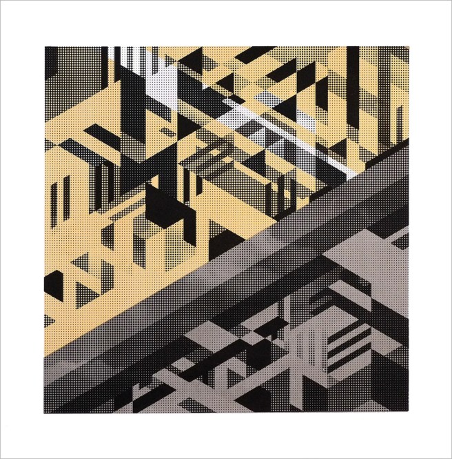
Metro by artist Chris Homer is an abstract composition of screen printed gold, grey and black in a striking halftone and geometric pattern. The strong graphic style of Chris Homer’s work has a very modern feel, but still with an air of art deco elegance.

Brass and Bold are a London based brand founded by designer Elsa Gomez. Her designs are made from raw brass and painted brass, and explore the simplicity and honesty of materials. Taking inspiration from the clean lines and contrasting colour of the art deco movement, she produces stylish and contemporary jewellery perfect for your next cocktail party!


The 1920’s style of art deco is characterised by bold lines, shapes, and angles. You too can recreate that look, with this handy Art Deco Design Stencil. The art deco inspired typeface and shapes are perfect for all craft projects, such as card making, scrap-booking or just illustrating your favourite notebooks. A great gift for tweens to adults.

1.ART-DECO-STENCIL-01-Another-Studio-ofcabbagesankings-oc&k

City guides are aimed at the ‘urban explorer’. This two-sided folding Art Deco London Map features over seventy leading examples of art deco architecture in London – from Eltham Palace to the Hoover Building. Art deco landmarks such as Broadcasting House, 55 Broadway, and Senate House are included along with Charles Holden’s finest Underground Stations and more. The reverse side of the map features an introduction to art deco by Henrietta Billings, photos by Simon Phipps and details about each building.

1.ART_DECO_MAP_blue_crow_media_5_ofcabbagesandkings__44933.1474903671.1200.1200

Achieve a modern look with echos of a geometric art deco style. These brass Pineapple Pots and steel Convert Vases are ideal for adding a metallic touch to an interior. Made from a thin sheet of metal which is carefully folded and converted into shape by hand at Another Studio in London, the Pineapple Pots are perfect for holding a small succulent or cacti.

1.PINEAPPLE_POT_Another_Studio_ofcabbagesandkings_ock02grey__45364.1479300794.1200.1200


BRUTALISM

The mid-century architectural style of brutalism divides opinion. Descending from modern architecture it is characterised by monolithic block-like shapes, often celebrating the rawness of material, especially concrete. It is heavy, stark and solid.

1.HAYWARD-GALLERY-LONDON-01-Will-Clarke-ofcabbagesandkings__67196.1549992107.1200.1200

There are many examples of brutalist architecture in London and one notable building is The Hayward Gallery on the Southbank. Sitting along the banks of the River Thames it forms part of the Southbank Centre. The Hayward has become a brutalist landmark and artist Will Clarke has captured it beautifully in his detailed illustration. It is screen printed in two colours, a combination of black lines with luscious gold ink elements.

1.BETON-HOOP-EARRINGS-02-Tom-Pigeon-ofcabbagesnadkings-ock__03037.1539263513.1200.1200

Tom Pigeon is a creative studio founded by Pete and Kirsty Thomas in 2014. Designing simple and well-considered products across accessories, prints, and stationery.

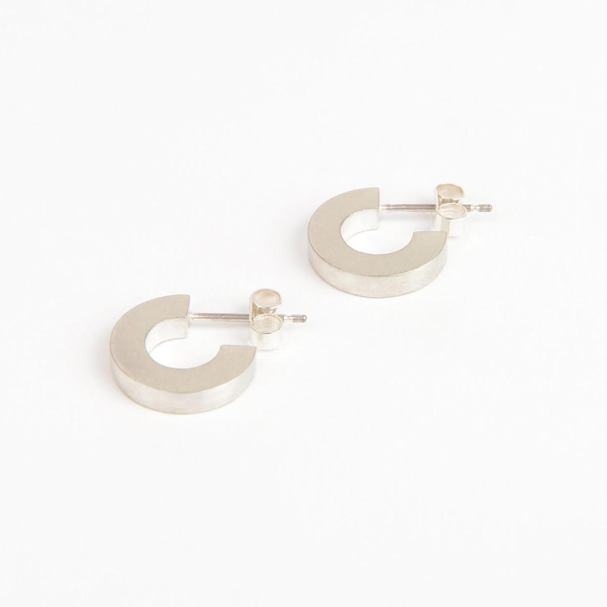
Among these is the Béton range of jewellery – a unique unisex collection from Tom Pigeon Studio. Popularised by Le Corbusier, the term béton originates from the French ‘béton brut’ or ‘raw concrete’ and this hand-crafted solid silver jewellery is influenced by the strong lines, hidden angles, and sharp shadows of brutalist concrete architecture. Its matt finish also gives a nod to the rough texture of raw concrete.

1.BRUTALIST-CLIPS-01-Another-Studio-ofcabbagesankings-ock__08229.1510054507.1200.1200

Produced to scale (5000 times smaller than the real buildings!) this bookmark set from Another Studio celebrates four fantastic London brutalist buildings: Trellick Tower, Barbican Tower, Space House, and National Theatre. A great gift for every architecture lover and perfect for a Secret Santa or quick stocking filler.

Fans of the movement will certainly love this Brutalist Calendar 2020. A limited edition monthly celebration of some of the most awe-inspiring and influential examples of brutalist architecture from around the world, it will provide connoisseurs of concrete with twelve months of brutalist bliss!⁠⠀

1.BRUTALIST-CALENDAR-01-Blue-Crow-Media-ofcabbagesandkings

For those brutalist adventurers who are keen to explore these pick-me-up maps are ideal. Also featured in the range are Washington, Paris, Sydney, and London.

Follow my blog with Bloglovin


The Make Bank: Tackling Creative Poverty

b40mxyQA

We are very excited to tell you about a new social project aimed at addressing some of the issues surrounding ‘creative poverty’ and young people’s access to art and design subjects and careers. The Make Bank has been set up by Kirsty Thomas, a former art and design teacher, and founder of creative studio Tom Pigeon. Kirsty’s research revealed that in recent years there has been a significant increase in the number of secondary pupils dropping out of creative subjects. She discovered that while some pupils were being advised that the creative industries did not offer a viable career path and that perhaps they should get a ‘proper job’, on other occasions it was because they simply didn’t have, or couldn’t afford the tools they needed to complete the course. This is where The Make Bank comes in.

Kirsty+Thomas_headshot4
The Make Bank Founder Kirsty Thomas

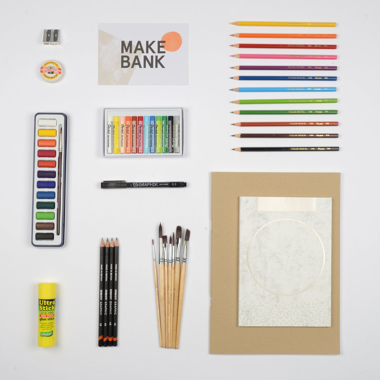
By providing Art and Design Kits for disadvantaged pupils, The Make Bank can help students who want to pursue creative education. Working with schools across the country The Make Bank has created quality art and design kits devised to meet the needs of all young people aged over 13 following the National Curriculum in Scotland, England, Ireland and Wales. For pupils studying GCSE, A Level, National 5, Higher and Advanced Higher qualifications they have created five subject-specific kits, so whether it’s art, design, photography, textiles or ceramics the students have the right tools for the job! Any pupil can apply for a Make Bank Kit in partnership with their teacher and it will be sent directly to their school.

art+kit_web

Alongside the kits the project also works with industry professionals to share inspiring stories, creative journeys and career advice, nurturing, inspiring and encouraging creative talent in young people and helping them recognise the wealth of opportunity that exists within the creative industries. To raise money for the kits Kirsty has teamed up with some of UK’s most exciting artists, illustrators and designers on the Make Bank Print Project, some of who we know very well here at Of Cabbages and Kings. You can find these ones, The Language of Colour by Stuart Gardiner (below), in our shop too. However, if prints aren’t you’re thing and you would like to donate directly just follow this link


We love this project, however materials alone will not create a new and diverse generation of creatives. Young people need guidance, support, inspiration and knowledge to enable them to pursue a creative career. The Make Bank is calling on everyone within the creative industries and beyond to stand up and do something about Creative Poverty. This is our opportunity to create a thriving industry that is equal, diverse and fair.

Would you like to get involved?  Visit the The Make Bank

Follow my blog with Bloglovin
 

An Interview with Sarah Beaton

Ahead of her upcoming show IN + OUT at Of Cabbages and Kings, Sarah Beaton talks through the processes that go into creating her bold expressive brush strokes.

1-2
Sarah Beaton’s Studio in Shoreditch

What is your artistic weapon of choice? Pencil, pen, paintbrush, digital….

I love the bleeding of water and paint – watercolour is probably my favourite.

How long have you been painting for? When did you start out?

I have enjoyed painting and drawing from a very young age. My dad was an art teacher so art was always a celebrated skill to explore in my family.

1
Brush stroke experiments with watercolour

Your pictures evoke landscapes. Do you start with that in mind or do you let the brushstrokes inspire you?

I am inspired by nature and find it to be my escape from the busy London life. I don’t usually have a particular image in mind. I enjoy being spontaneous and seeing what develops from the brushstrokes.

1.To_the_Edge_and_Back_-_sarah_beaton_-_of_cabbages_and_kings__25108.1533653706.1200.1200
To The Edge And Back by Sarah Beaton

Where did the idea for including the figures come from?

I was working in my studio listening to the Damian Rice album, My Favourite Faded Fantasy. On the album cover, there is a series of figures on a large wall with a ladder. I loved the illustrative nature of it and decided to try and make my own little images.

35179290_607521426286033_965236828250570752_n
A selection of brushes used to create various marks in Sarah’s work

You use a deep dark blue in your work, what drew you to that colour?

I love water and blue, for me, is the most calming of colours. It can be intense but also very tranquil. I enjoy the extremes of it.

2

You are also a theatre designer, do the two influence each other?

I feel they cross fertilise. Designing for theatre is all about telling stories through a visual narrative. I work in scale all the time and I feel this feeds into my watercolours: finding stories and compositions within an abstract image.

30855164_186884341939105_2429028207475818496_n
Each print is professionally scanned and printed onto Hahnemuhle German Etching 310 gsm

What is your favourite takeaway?

I love Thai food. So anything vegan and Thai is a winner.

You can see more of  Sarah’s work on our website or in the shop. Feel free to pop by on Tuesday 14th August from 7-9pm to meet her in person, view the work up on the walls and enjoy a glass.

1.On_the_Crest_of_a_Wave_-_sarah_beaton_-_of_cabbages_and_kings__54159.1533654434.1200.1200
On The Crest of A Wave – Sarah Beaton

Follow my blog with Bloglovin