

A cyanotype print of a coat. Image: Liz Loveless – Factory Press
Ahead of our upcoming exhibition with Liz Loveless of Factory Press we take a look at cyanotypes. In this show Liz presents us with a selection of artwork involving the cyanotype process. But what is a cyanotype and how are they created?


Dandelion and Grass cyanotypes by Liz Loveless
A cyanotype is a photographic process involving chemicals on paper or fabric that produces cyan blue prints. It was discovered by Sir John Herschel in 1842 as a way of reproducing drawings and diagrams such as architectural blueprints. Cyanotypes are a type of contact print which means the actual image being reproduced is placed directly over the paper. This opens it up to a whole host of creative possibilities, not just reproducing drawings, but using 3D objects. Liz uses this to great effect in her cyanotype works. Everyday objects such as bikes, coats, bottles and vegetation are used to create prints with a unique one-off quality.


A bike being exposed under a UV light onto treated paper. Image: Liz Loveless – Factory Press
To create a cyanotype a mixture of potassium ferricyanide and ferric ammonium are combined to create a photosensitive solution that is then applied to paper. This is allowed to dry in the dark to avoid exposure until it is ready to use. To create a print you must expose this coated paper to UV light, for example sunlight. This then creates a chemical reaction in the parts that are exposed to the light then darkening them. When fully exposed the chemical coated paper is then rinsed under running water. This washes away the unexposed chemical that was in shadow leaving a blank space, surrounded by the blue that was exposed to the light.

A large palm leaf being exposed in sunlight. Image: Liz Loveless – Factory Press
The most simple way of creating a cyanotype print is to lay objects on to your coated paper and then expose to sunlight. You can experiment with any objects. The more solid an object and the closer it is to the paper the more crisp a result you will get. Further away or less solid an object you will begin to get fuzzier edges. This is most apparent when using natural materials like leaves and flowers. Their 3D quality creates an unpredictable silhouette that fades from crisp dark blue to pale blue blurs. After the cyanotype has had an appropriate time in the sun (this can vary depending on the strength of the sunlight) it is then rinsed under running water and left to dry.

Finished print being rinsed. Image: Liz Loveless – Factory Press
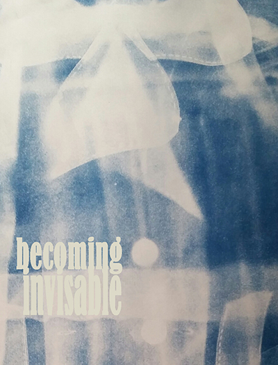
Liz Loveless will be exhibiting more of her cyanotype prints at Of Cabbages and Kings in the show ‘Becoming Invisible‘, which runs from 6 February to 31 March 2020.
You can also book a spot on our Cyanotype Workshop – 2-4pm Saturday 14th March 2020.


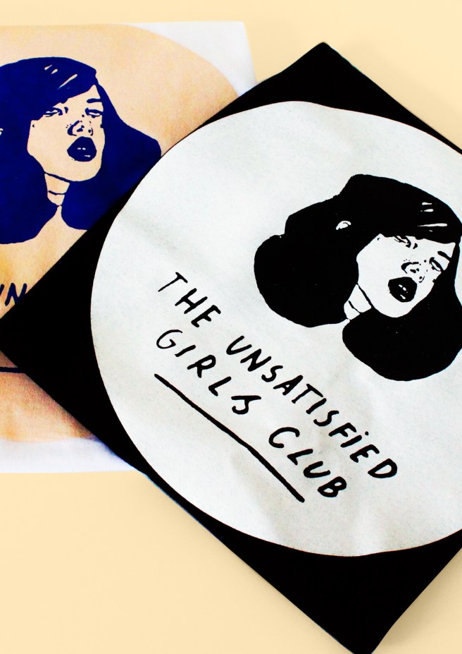
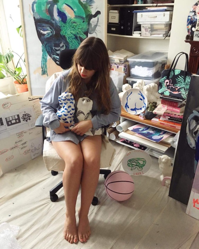
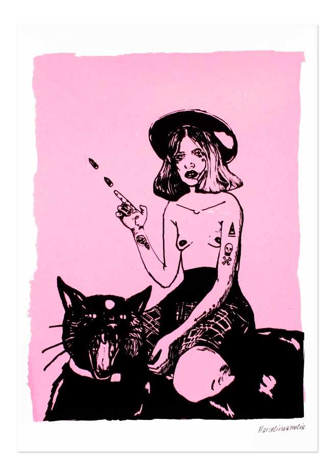


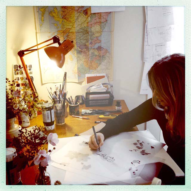


 What is your artistic weapon of choice? Pencil, pen, paintbrush, printing squeegee…


