There are many ways to replicate an image in print, and one of them is to screen print using CMYK colours. So what are CMYK colours and how do artists use them to print their artwork?
CMYK stands for Cyan, Magenta, Yellow and Key. Key usually being the black layer that is used to align the other colours. These four colours are layered and used in combination with halftoning to create an almost infinite number of colours. It starts with separating the cyan, magenta, yellow and black colours from the image and creating new separate images with each of these individual colour values. A halftone is created from these single colour images which means turning the image into tiny dots.
These tiny dots are printed at different sizes depending on how dense that particular colour is in an area of the image. For example an area printed with small cyan dots would appear as pale cyan and larger dots would be a darker cyan. This is because there would be more or less of the white space of the paper showing between the different sized dots. As the dots are so small your eye reads them as one colour when looked at from a distance. To create multiple colours cyan, magenta, yellow and black are combined together at various densities to give the illusion of one colour. On a very basic level an equal sized yellow dot overlaid with a cyan dot would give you green. Changing the size of these dots would give you a pale yellowy green or a darker blue green. With the addition of magenta and black you can create all sorts of colours.
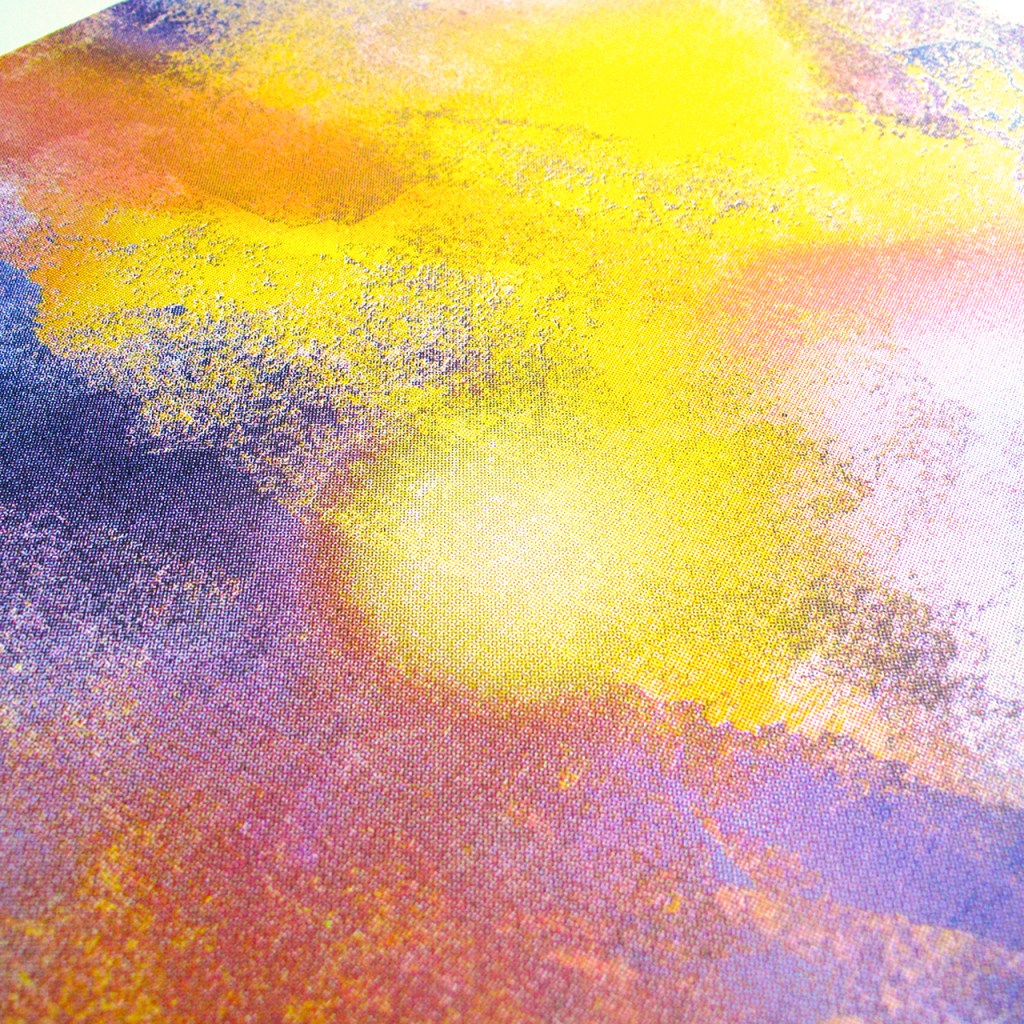
If you look closely at Ponds and Plants by Ashley Amery for example, you can see the small dots that make up the image. It’s easy to see in newspaper imagery where the dots are bigger you get a crude image, and where they are smaller a finer image can be created. Each dot is overlaid at a particular angle so as not to create a uniform pattern that the eye would recognise. If you look closely you can see a rosette pattern of the overlaid dots which is characterful of halftone printing. If the dots are not lined up correctly or are larger, a moiré or interference pattern appears which can cause the image to look blurry.
Below is a selection of artworks that use CMYK separation and halftone printing to recreate the imagery. Some are more obvious but some need a closer look.

Penguin by Gavin Dobson
Screen print on Fabriano paper 310gsm with a deckle edge.
500mm x 700mm
Signed limited edition of 100

Ponds And Plants by Ashley Amery
Screen print on 350gsm GF Smith Colorplan paper
490mm x 550mm
Signed limited edition of 50
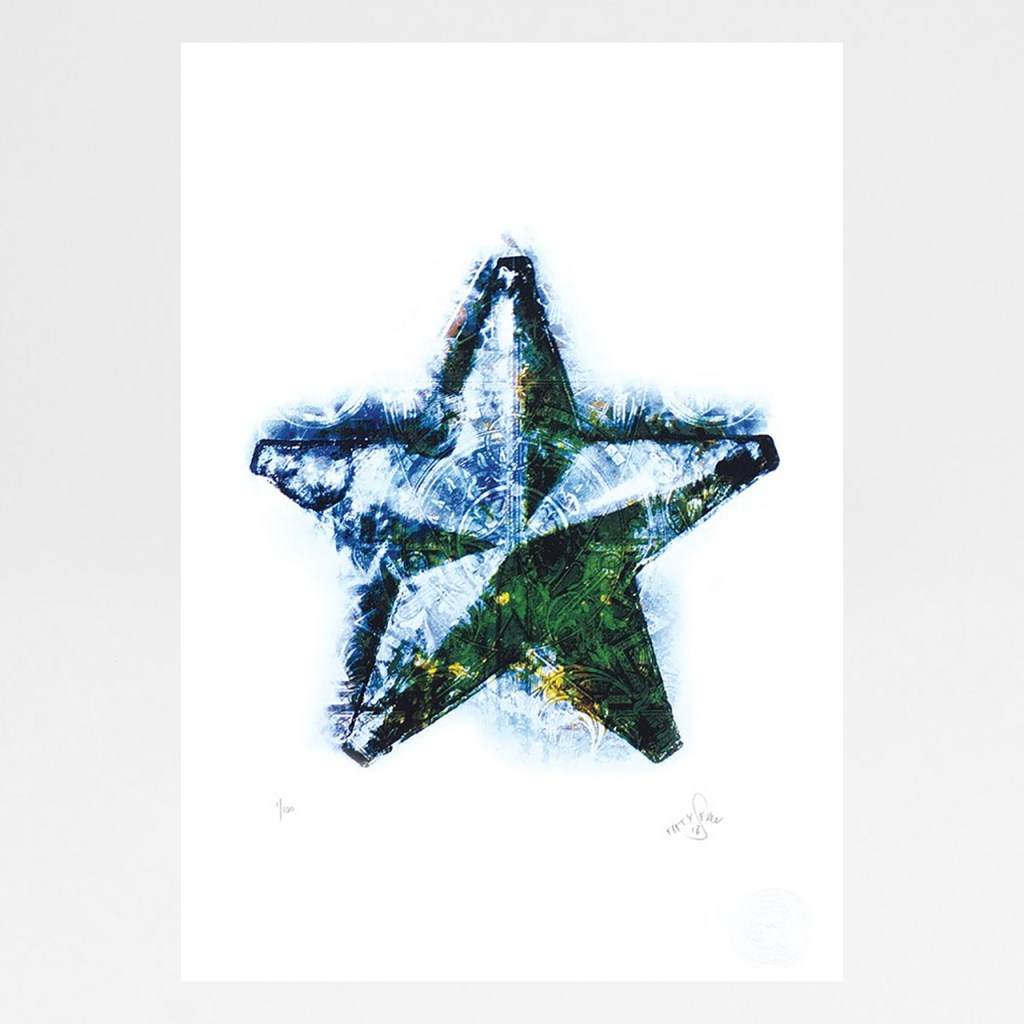
Morning Star by Fiftyseven
Screen print on 330gsm GF Smith paper
297mm x 420mm (A3)
Signed limited edition of 100
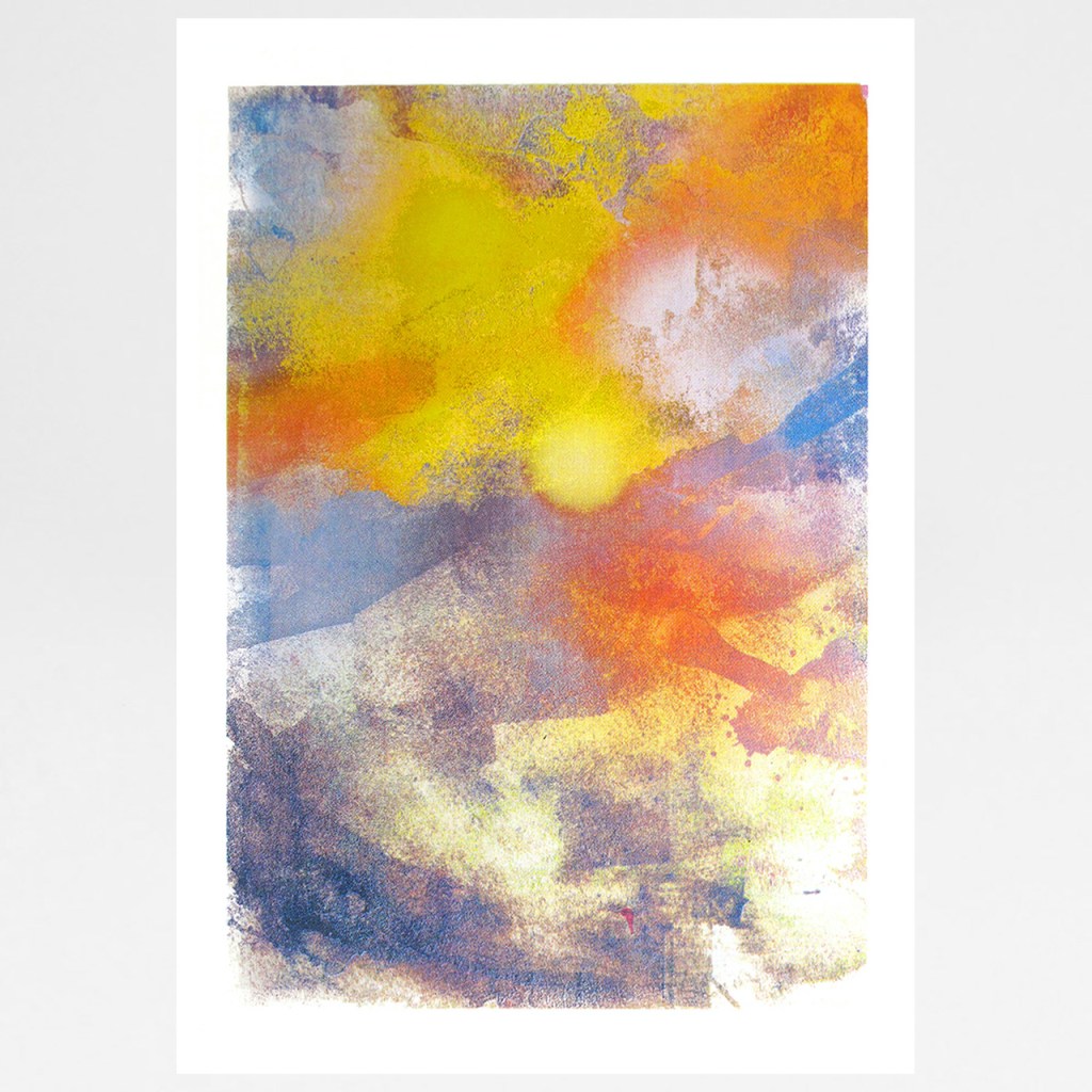
Sunrise by Gavin Dobson
Screen print
500mm x 700mm
Signed limited edition of 100